
Local tradespeople in Australia need websites that work smoothly on any device, especially when clients want fast answers during urgent jobs. Understanding exactly what electricians, plumbers, and other tradies expect from their mobile site leads to a better digital experience and more client calls. By starting with a comprehensive needs assessment, you set the foundation for building mobile-friendly sites that meet real-world demands and boost engagement from the first tap.
Table of Contents
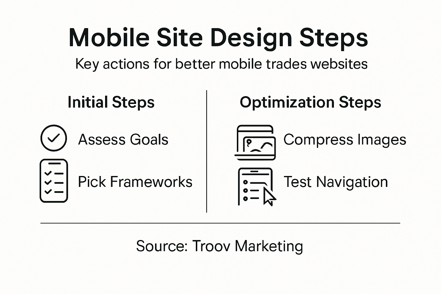
- Step 1: Assess Client Needs And Mobile Goals
- Step 2: Choose Responsive Frameworks And Layouts
- Step 3: Optimise Images And Interactive Elements
- Step 4: Refine Navigation For Touch Devices
- Step 5: Test Performance Across Mobile Platforms
Quick Summary
| Key Point | Explanation |
|---|---|
| 1. Understand Client's Mobile Needs | Conduct thorough assessments to identify specific mobile objectives, user behaviour, and key demands for trade websites. |
| 2. Choose the Right Framework | Select responsive frameworks that offer flexibility, customisation, and performance to optimise mobile site functionality. |
| 3. Optimize Images for Mobile Use | Implement image compression and responsive techniques to ensure fast loading times and an excellent user experience. |
| 4. Design Touch-Friendly Navigation | Create intuitive navigation with larger tap targets and clear feedback to enhance user engagement on mobile devices. |
| 5. Test Across Multiple Devices | Regularly test website performance on various devices and browsers to ensure optimal functionality and user experience. |
Step 1: Assess client needs and mobile goals
Designing a mobile-friendly website for trades starts with a thorough understanding of what your client actually wants. The key is diving deep into their specific mobile objectives and user experience requirements. Comprehensive needs assessment isn't just a buzzword - it's about uncovering the precise digital expectations of tradies looking to attract more local customers.
To effectively assess client needs, you'll want to conduct a strategic consultation that covers several critical areas:
- Business type and primary mobile website goals
- Target audience demographics and mobile usage patterns
- Specific information customers want to access quickly
- Preferred methods of customer contact (phone, email, booking form)
- Existing digital presence and current website performance
Mobile user context reveals that trade professionals need websites optimised for quick information access. This means creating interfaces that allow potential customers to find contact details, service descriptions, and booking options within seconds. Your assessment should focus on understanding how mobile users interact with trade business websites - typically seeking immediate solutions to urgent problems.
The most successful mobile designs emerge from deep understanding of client-specific mobile goals and user behaviour.
Pro tip: Schedule an initial discovery meeting where you ask open-ended questions and listen carefully to the client's vision, allowing them to describe their ideal mobile website experience in their own words.
Step 2: Choose responsive frameworks and layouts
Selecting the right responsive framework is crucial for creating mobile-friendly websites that work seamlessly across different devices. Responsive design frameworks provide essential tools and pre-built components that help tradespeople develop professional, adaptive websites without needing deep coding expertise.
When evaluating frameworks, consider these key characteristics:
- Flexibility and customisation options
- Mobile-first design approach
- Performance and loading speed
- Browser and device compatibility
- Built-in responsive grid systems
- Pre-styled component libraries
CSS responsive techniques are fundamental to creating layouts that adapt smoothly across different screen sizes. Popular frameworks like Bootstrap, Tailwind CSS, and Foundation offer robust solutions for tradies wanting professional-looking mobile websites without extensive programming knowledge. Each framework has unique strengths - some prioritise customisation, while others focus on rapid development and lightweight performance.

Here's a side-by-side comparison of popular responsive frameworks for trade websites:
| Framework | Customisation Level | Ideal For | Standout Feature |
|---|---|---|---|
| Bootstrap | Moderate | Rapid professional sites | Extensive grid system |
| Tailwind CSS | High | Bespoke mobile designs | Utility-first styling |
| Foundation | Flexible | Unique layout needs | Accessible components |
The most effective responsive framework will align perfectly with your specific mobile design requirements and technical capabilities.
Pro tip: Always test your chosen framework across multiple devices and screen sizes before finalising your website design to ensure consistent performance and user experience.
Step 3: Optimise images and interactive elements
Creating a mobile-friendly website for trades requires careful attention to image performance and interactive design. High-performance image optimization is crucial for ensuring fast loading times and a smooth user experience across different mobile devices.
When optimising images for mobile websites, consider these key strategies:
- Choose appropriate file formats (JPEG for photos, PNG for graphics)
- Compress images without losing quality
- Implement lazy loading for off-screen content
- Use responsive image techniques
- Select modern formats like WebP for efficiency
Responsive design best practices emphasise creating touch-friendly interactive elements. This means designing buttons and clickable areas that are at least 48x48 pixels, with sufficient spacing to prevent accidental taps. Interactive components should provide clear visual or haptic feedback, ensuring users understand their actions have been recognised.
Review this summary of mobile optimisation tactics and their business impacts:
| Optimisation Tactic | User Benefit | Business Outcome |
|---|---|---|
| Image compression | Faster page loads | Lower bounce rate |
| Touch-friendly buttons | Easier navigation | Higher conversion rates |
| Lazy loading | Smooth scrolling | Improved site speed scores |
Mobile optimization is about creating a seamless, intuitive experience that works effortlessly across different devices and screen sizes.
Pro tip: Use online image compression tools to reduce file sizes without compromising visual quality, and always preview your website on multiple mobile devices to ensure consistent performance.
Step 4: Refine navigation for touch devices
Designing intuitive mobile navigation is critical for trade websites that want to keep potential customers engaged. Touch-friendly navigation elements require strategic planning to ensure users can easily explore your site without frustration.
Key considerations for touch-friendly navigation include:
- Implement larger tap targets (minimum 48x48 pixels)
- Create sufficient spacing between interactive elements
- Use clear visual feedback for touch interactions
- Prioritise critical navigation items
- Design menus that work efficiently on small screens
Mobile navigation design should consider thumb reach zones, strategically positioning primary controls where users can comfortably access them. This means focusing on bottom-screen placement and using progressive disclosure techniques like collapsible menus that reveal information gradually and reduce cognitive load.
Effective mobile navigation is about creating an effortless, intuitive journey for users with their fingertips.
Pro tip: Test your mobile navigation with real users and observe their interaction patterns, paying close attention to how easily they can access key information without zooming or scrolling extensively.
Step 5: Test performance across mobile platforms
Ensuring your trade website performs flawlessly across different mobile devices is crucial for maintaining a professional online presence. Mobile-friendly testing tools provide comprehensive solutions for validating your website's responsiveness and functionality across numerous devices and browsers.
Key testing strategies for mobile performance include:
- Evaluate responsive design on multiple screen sizes
- Check loading times under different network conditions
- Test interactive elements and navigation
- Verify cross-browser compatibility
- Assess touch interaction responsiveness
Comprehensive mobile browser testing goes beyond simple visual checks. It involves rigorous examination of layout adaptability, functionality of interactive elements, and performance consistency across platforms like Chrome, Safari, and Firefox. Trade websites need to maintain usability and speed to keep potential customers engaged and prevent them from navigating away.
Mobile performance testing is not a one-time event but an ongoing process of refinement and optimization.
Pro tip: Create a systematic testing checklist that includes testing on at least three different device types and two network speeds to ensure comprehensive mobile performance validation.
Unlock a Mobile Website That Truly Works for Your Trade Business
Many tradespeople struggle with websites that are not built for mobile users who need quick access to information and touch-friendly features. The challenge is creating a site that loads fast, uses responsive design frameworks, and offers smooth navigation on all devices. If you feel frustrated by complicated layouts or slow-loading images that turn customers away, you are not alone. Understanding your specific mobile goals and optimising user experience matters more than ever.
At Troov Marketing, we specialise in crafting mobile-friendly websites tailored specifically for small business web designers and tradies. Our solutions focus on responsive layouts, image optimisation, and intuitive navigation to keep your customers engaged and boost conversions. Don’t let poor mobile design hold your business back. Visit our website today to discover how we can transform your online presence. Start the journey to a mobile website that delivers real results now. Learn more about our services at Troov Marketing and take the first step towards a professional, fast, and user-friendly trade website.
Frequently Asked Questions
How do I assess my client's mobile needs for their trade website?
To assess your client's mobile needs, conduct a thorough consultation focusing on their business type, audience demographics, and specific information customers need access to. Gather insights on their preferred contact methods and evaluate their existing digital presence to pinpoint improvement areas.
What are the essential features of a responsive framework for a trade website?
A responsive framework should have flexibility, a mobile-first design approach, and performance optimisation. Prioritise frameworks that include built-in grid systems and pre-styled components to make development simpler and more efficient.
How can I optimise images for a mobile-friendly trade website?
To optimise images, choose the right file formats, compress images effectively without quality loss, and implement lazy loading for off-screen content. This can significantly improve page load speeds, leading to a better user experience and a lower bounce rate.
What are best practices for mobile navigation design in trade websites?
Best practices for mobile navigation include implementing larger tap targets, ensuring sufficient spacing between elements, and prioritising critical navigation items. Aim for intuitive navigation that allows users to access key information easily, enhancing user engagement and satisfaction.
How do I test the performance of a mobile-friendly trade website?
Test the website using various mobile devices and different network conditions to ensure compatibility and performance. Create a checklist that includes responsive design evaluation and functionality checks, aiming for seamless user experiences under different scenarios.