
Your property website might be turning away half your potential clients before they even see a listing. When Melbourne property professionals fail to implement responsive design, sites that load slower than 3 seconds on mobile lose over 50% of potential visitors, directly killing enquiries. This guide delivers actionable responsive design techniques tailored for property websites, covering mobile-first principles, local SEO integration, performance optimization, and troubleshooting to transform your online presence into a lead-generating machine.
Table of Contents
- Prerequisites And Planning Your Responsive Property Website
- Core Principles Of Responsive Design For Property Websites
- Integrating Local SEO With Responsive Web Design
- Performance Optimization And Visual Content Best Practices
- Common Mistakes And Troubleshooting In Responsive Property Websites
- Implementation Timeline, Costs, And Expected Outcomes
- Advanced Alternatives And Future-Proofing Responsive Property Websites
- Discover Expert Responsive Web Design & SEO Services In Melbourne
- Frequently Asked Questions
Key Takeaways
| Point | Details | |-------|---------|| | Mobile-first responsive design reduces bounce rates and increases enquiries by prioritizing the majority mobile audience. | | Integrating local SEO with responsive architecture improves Melbourne search visibility and attracts qualified leads. | | Optimized media and Core Web Vitals ensure page loads under 3 seconds, retaining visitors and improving rankings. | | Avoid common pitfalls like neglecting tablet breakpoints and poor image compression that damage user experience. | | Plan responsive redesign projects over 6-12 weeks to achieve measurable improvements in engagement and conversions. |
Prerequisites and Planning Your Responsive Property Website
Successful responsive design starts long before you touch code. Owning your domain and platform is non-negotiable. Avoid broker-controlled subdomains or IDX platforms without ownership, as losing control means losing SEO equity and your entire content library. When you own your assets, you control your destiny.
Consider this: mobile devices account for over 58% of global web traffic, making mobile-first thinking essential from day one. Melbourne property searchers browse listings on phones during commutes, at cafes, and between appointments. Your site must deliver flawlessly on every screen size or you're invisible to more than half your market.
You'll need specific tools before starting. Image optimizers supporting WebP format dramatically reduce file sizes without quality loss. Basic knowledge of CSS Grid and Flexbox enables fluid layouts that adapt naturally. Understanding foundational local SEO concepts helps you build search visibility into your site structure rather than bolting it on later. Planning these elements upfront prevents costly common website mistakes that plague rushed projects.
| Prerequisite | What You Need | Why It Matters |
|---|---|---|
| Domain Ownership | Registered domain in your name, not broker platform | Protects SEO equity and content control |
| Hosting Control | Managed hosting with performance optimization | Ensures fast load times and uptime |
| Image Tools | WebP converters, compression software | Reduces page weight for mobile speed |
| CSS Knowledge | Grid/Flexbox understanding or developer access | Enables proper responsive layouts |
| Local SEO Basics | Google Business Profile, schema markup awareness | Integrates search visibility from launch |
Pro Tip: Set up Google Search Console and Analytics before launching your responsive redesign. Baseline metrics let you measure exactly how much your bounce rate, mobile engagement, and enquiry conversion improve post-launch.
Core Principles of Responsive Design for Property Websites
Responsive design for property sites isn't about shrinking desktop layouts. It's about rethinking how potential clients interact with your content on every device. The mobile-first design approach, starting from smallest screens upwards, forces you to prioritize essential features and strip away bloat that kills conversion rates.
Start with your phone layout. What must a property searcher see immediately? Featured listings, contact buttons, and search filters deserve prime real estate. Desktop versions can add supplementary content like market reports and team bios. This hierarchy ensures mobile users get value instantly rather than scrolling through desktop-centric clutter.
Fluid grids and flexible media using CSS Grid and Flexbox enable smooth adaptation across devices. Grid systems let listing cards reflow from single column on phones to three columns on desktops automatically. Flexbox handles navigation menus, property detail sections, and enquiry forms that resize gracefully without breaking.
Define breakpoints strategically. Most sites need at least four: small phones (320px), large phones (480px), tablets portrait (768px), tablets landscape (1024px), and desktops (1200px+). Property websites often need tablet landscape breakpoints because clients browse listings on iPads during viewings. Missing this breakpoint creates awkward layouts that frustrate users at critical decision moments.
Images and videos must scale proportionally. Use max-width: 100% and height: auto on all media elements. Property photos should never overflow their containers or force horizontal scrolling. Virtual tour embeds need responsive wrappers that maintain 16:9 aspect ratios across screens.
Pro Tip: Test your responsive layouts using browser DevTools device emulation, but also grab physical devices. Touch targets, font sizes, and spacing often feel different on actual phones versus simulated viewports. Integrating design and local SEO principles from the start creates cohesive user experiences that rank well and convert visitors.
Integrating Local SEO with Responsive Web Design
Responsive architecture supercharges local SEO in ways separate mobile sites never could. A single responsive website consolidates all link equity, avoids duplicate content penalties, and presents Google with one authoritative source. SEO benefits of responsive design include unified link equity and higher local search rankings because every backlink strengthens one site instead of splitting authority.
Google uses mobile-first indexing, meaning your mobile layout determines search rankings even for desktop searchers. If your mobile site hides content, uses tiny fonts, or loads slowly, your rankings suffer across all devices. Responsive design ensures Google sees identical content everywhere, eliminating indexing confusion and ranking penalties.
Link your Google Business Profile prominently in site headers and footers. Melbourne property searchers often discover your GBP listing first, then visit your website. Making this connection seamless with click-to-call buttons and location pages improves user experience and signals local relevance to search engines.
Structured data markup for properties amplifies search visibility. Schema.org vocabulary helps Google understand listing details like price, bedrooms, location, and availability. When implemented correctly on responsive templates, rich snippets appear in mobile and desktop results, increasing click-through rates from search.
| Approach | SEO Impact | UX Impact | Maintenance |
|---|---|---|---|
| Responsive Design | Unified link equity, single indexing, higher rankings | Consistent experience, no redirects, fast loading | One codebase, easier updates |
| Separate Mobile Site | Split link equity, duplicate content risk, lower rankings | Mobile redirects, slower, inconsistent content | Two codebases, doubled effort |
The comparison is stark. Responsive wins on every metric that matters for Melbourne property businesses competing in local search. Quality leads come from searchers who find you easily, navigate smoothly, and trust your professionalism. Local SEO and responsive design integration delivers this complete package, while exploring SEO best practices and understanding beginner SEO concepts ensures your foundation remains strong.
Performance Optimization and Visual Content Best Practices
Speed separates successful property websites from abandoned ones. Remember, sites slower than 3 seconds lose over 50% of mobile visitors. Every millisecond counts when competing for impatient property searchers browsing dozens of listings.
Next-generation image formats like WebP reduce file sizes by 25-35% compared to JPEG without visible quality loss. Convert all property photos to WebP with JPEG fallbacks for older browsers. Compress images before upload using tools like TinyPNG or ImageOptim. A 5MB photo might look sharp on desktop, but it murders mobile load times and burns through data allowances.
Lazy loading defers offscreen images and videos until users scroll near them. This technique slashes initial page weight dramatically. A property detail page with 30 photos might load only the first 5 immediately, fetching others as visitors scroll. Users get instant content while total load time drops by seconds.
Core Web Vitals measure real user experience through three metrics: Largest Contentful Paint (LCP), First Input Delay (FID), and Cumulative Layout Shift (CLS). Target LCP under 2.5 seconds, FID under 100ms, and CLS below 0.1. These aren't arbitrary numbers. Google uses them for ranking, and users abandon slow, janky sites instantly.
Virtual tours and video walkthroughs engage buyers powerfully but can devastate performance. Host videos on YouTube or Vimeo rather than self-hosting. Use thumbnail images with play buttons that load full videos on click. Embed responsive video players with lazy loading attributes. This approach delivers rich media without the performance penalty.
Pro Tip: Balance visual richness with speed by prioritizing above-the-fold content. Load hero images and primary listing photos first using priority hints. Secondary galleries, testimonials, and team photos can lazy load. Understanding performance and SEO synergy alongside leveraging website optimization tools helps you make smart tradeoffs that maximize engagement without sacrificing speed.
Common Mistakes and Troubleshooting in Responsive Property Websites
Even experienced developers stumble on responsive design pitfalls specific to property sites. Neglecting landscape and tablet breakpoints and poor image optimization rank among the most damaging errors that kill mobile conversions.
Ignoring tablet breakpoints creates awkward experiences on iPads and Android tablets. Property searchers often use tablets during viewings to compare listings or share options with partners. When your three-column desktop grid crams onto a tablet without adjustment, text becomes unreadable and touch targets overlap. Add specific CSS media queries for tablet portrait (768px) and landscape (1024px) to optimize these crucial use cases.
Overloading mobile layouts with desktop features bloats page weight and confuses navigation. Your mobile site doesn't need every widget, sidebar, and call-to-action that appears on desktop. Prioritize ruthlessly. Featured listings, search functionality, and contact methods matter most. Market reports and lengthy bios can move to desktop-only sections or separate pages.
Using broker-owned domains or platforms means you're building someone else's asset. When contracts end or you switch brokers, you lose your domain, content, and all accumulated SEO value. Years of ranking work vanishes overnight. Always register domains in your name or business entity. Host on platforms you control or can migrate freely.
Slow image loading from poor optimization frustrates mobile users who abandon before seeing your best listings. Compress every image. Use WebP format. Implement lazy loading. Test actual load times on 3G connections, not just office WiFi. Melbourne has excellent mobile networks, but users still encounter slow zones in buildings and transit.
Regular device testing catches layout breaks before clients do. Use browser DevTools for quick checks, but physically test on iPhones, Android phones, iPads, and various screen sizes quarterly. Touch interactions, font rendering, and spacing issues only surface on real devices. Avoiding these website mistakes protects your reputation and conversion rates.
Implementation Timeline, Costs, and Expected Outcomes
Realistic planning prevents disappointment and budget overruns. Responsive redesigns typically take 6 to 12 weeks depending on site complexity, listing volume, and custom feature requirements. Rushing produces sloppy work that requires expensive fixes later.
Costs vary significantly based on scope. A basic responsive template conversion with 10-20 pages might cost $3,000-$6,000. Fully custom designs with advanced filtering, IDX integration, virtual tour embedding, and extensive content creation run $10,000-$25,000+. Local SEO services add $500-$2,000 monthly depending on competition and target suburbs.
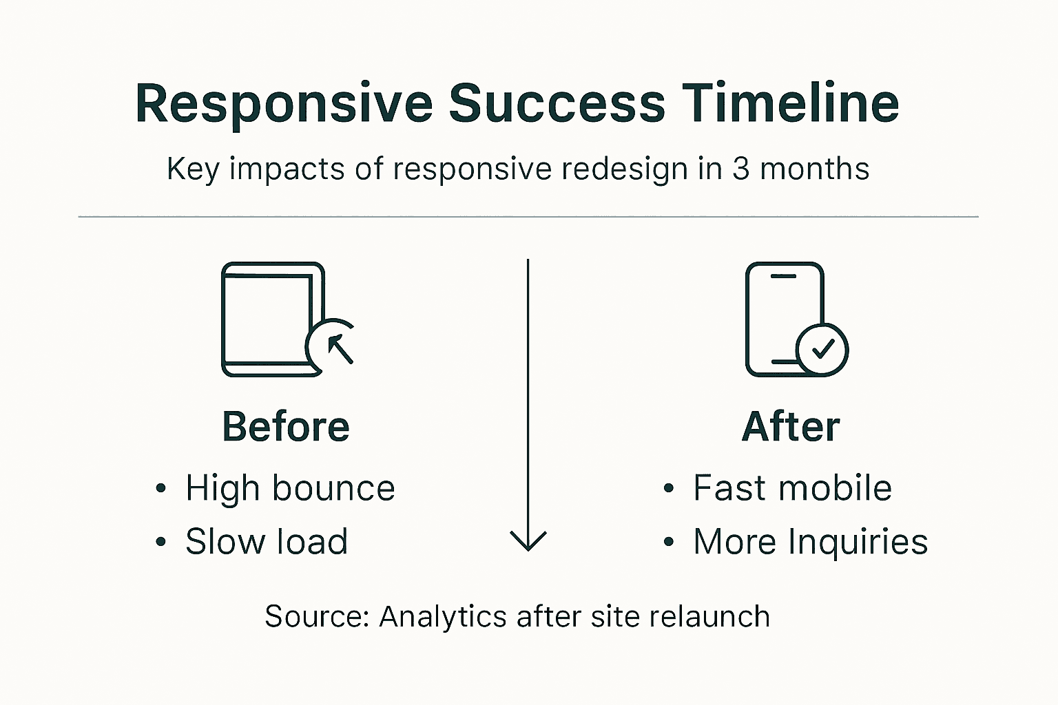
Expect measurable improvements within months. Mobile load times should drop under 3 seconds. Bounce rates typically decrease 25-40% as mobile UX improves. Local search rankings climb gradually, with noticeable gains in 3-6 months for targeted suburb and property type keywords. Enquiry conversion rates often improve 15-30% when forms and calls-to-action work seamlessly on all devices.
| Timeline Phase | Duration | Key Activities | Typical Cost Range |
|---|---|---|---|
| Planning & Audit | 1-2 weeks | Content inventory, competitor research, SEO audit | Included in project |
| Design & Prototyping | 2-3 weeks | Wireframes, mockups, breakpoint design | $2,000-$6,000 |
| Development | 3-5 weeks | Coding, CMS integration, responsive implementation | $3,000-$12,000 |
| Content & SEO | 1-2 weeks | Migration, optimization, schema markup | $1,000-$4,000 |
| Testing & Launch | 1 week | Device testing, performance optimization, deployment | $500-$2,000 |
Understanding SEO pricing and cost factors helps you budget appropriately and avoid lowball providers who cut corners on crucial elements like performance optimization and proper testing.
Advanced Alternatives and Future-Proofing Responsive Property Websites
Staying ahead means exploring emerging technologies that enhance responsive foundations. AI-driven adaptive layouts can personalize property website content, increasing engagement by 20-30% by showing relevant listings based on browsing behavior and preferences.
Progressive Web Apps (PWAs) combine responsive websites with app-like capabilities. Property searchers can install your PWA on phone home screens, receive push notifications about new listings, and browse saved properties offline. PWAs load instantly and work smoothly even on poor connections, crucial for maintaining engagement during property viewings in buildings with weak signals.
Tradeoffs exist between responsive sites and dedicated mobile apps. Native apps offer superior performance and offline functionality but require separate iOS and Android development, doubling costs and maintenance. Responsive sites with PWA features deliver 80% of app benefits at fraction of the cost for most property businesses.
Ongoing optimization keeps your site competitive as technology evolves. Monitor Core Web Vitals monthly. Update image formats as new standards emerge. Refresh content regularly to maintain search rankings. Test new devices and browsers quarterly. Local SEO requires continuous attention through Google Business Profile updates, review management, and content creation targeting Melbourne suburbs.
Scalability planning ensures your property website grows with your business. Choose platforms and architectures that handle increasing listing volumes without performance degradation. Structure your database and templates to accommodate new property types, suburbs, and features. Build with future integration in mind, whether that's CRM systems, chatbots, or emerging search technologies.
Pro Tip: Implement analytics tracking for specific responsive design elements like mobile enquiry forms, click-to-call buttons, and listing card interactions. This data reveals exactly how design choices impact conversions, guiding future optimizations based on real user behavior rather than assumptions.
Discover Expert Responsive Web Design & SEO Services in Melbourne
Building a responsive property website that converts requires specialized expertise combining design, development, and local SEO. Troov Marketing delivers tailored responsive web design services for Melbourne real estate professionals, integrating mobile-first architecture with local search strategies that drive qualified enquiries. Our expert mobile design approach ensures your property listings shine on every device while our proven website design and local SEO integration methodology maximizes Melbourne search visibility. Ready to transform your property website into a lead-generating asset? Discover how Troov Marketing creates fast, modern, search-optimized websites that turn visitors into enquiries.
Frequently Asked Questions
How does responsive design improve local SEO for Melbourne property websites?
Responsive sites unify all link equity and content into one authoritative source, avoiding duplicate content penalties that hurt separate mobile sites. Google's mobile-first indexing prioritizes responsive, mobile-optimized sites when determining rankings even for desktop searches. Integrating Google Business Profile links and structured data markup with responsive templates enhances local search visibility by signaling clear geographic and business relevance. Fast load times and consistent user experience across devices reduce bounce rates, which positively impacts search rankings because Google interprets lower bounces as quality signals.
What are the biggest mistakes to avoid when implementing responsive design for property sites?
Neglecting device breakpoints beyond basic phone sizes, especially tablet portrait and landscape orientations, creates frustrating experiences during property viewings when clients browse on iPads. Failing to optimize images through compression and next-gen formats causes slow page loads that lose over half your mobile visitors before they see listings. Using broker-owned domains or platform subdomains means losing complete SEO control and content when contracts end, wiping out years of ranking efforts instantly.
How long does a responsive redesign project typically take and what costs should I expect?
Project duration usually ranges 6-12 weeks depending on site complexity, listing volume, and custom feature requirements like virtual tour integration. Costs vary significantly with basic template conversions starting around $3,000-$6,000 while fully custom designs with advanced functionality run $10,000-$25,000+, and ongoing local SEO services add $500-$2,000 monthly based on competition.
Can AI-driven layouts and PWAs replace traditional responsive websites for property managers?
AI-driven adaptive layouts increase engagement by 20-30% through personalized content delivery, while PWAs offer offline capabilities and app-like experiences with home screen installation. However, these technologies complement rather than replace responsive design foundations, building enhanced functionality on top of solid mobile-first architecture that ensures your site works flawlessly across all devices and contexts.