
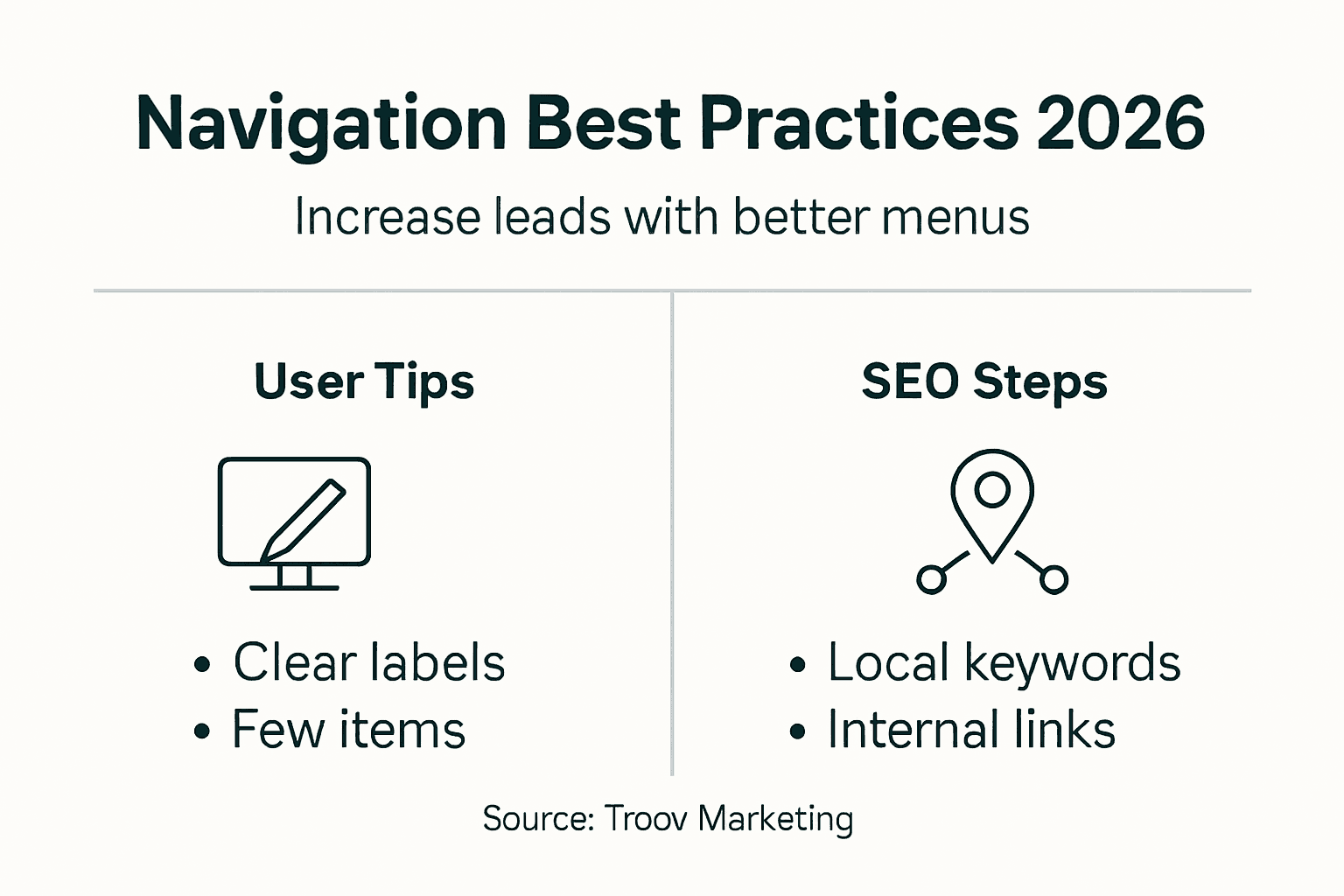
Most Melbourne business owners believe that cramming every service into their menu improves navigation. The opposite is true. Simplifying your website navigation can reduce bounce rates by 20% and directly increase enquiries. You'll learn how to build navigation that enhances user experience and supports local SEO, helping your Melbourne service business turn more visitors into customers.
Table of Contents
- Understanding The Role Of Navigation In User Experience
- Integrating Navigation With Local SEO Strategies
- Mobile-Responsive Navigation: Must-Have For Local Businesses
- Common Navigation Pitfalls That Harm Local SEO
- Comparing Navigation Styles And Their SEO Impacts
- Practical Steps To Optimize Navigation For Local Service Websites
- Case Studies: Local Melbourne Businesses Improving Results With Navigation
- Summary And Next Steps For Melbourne Local Business Owners
- Optimize Your Website Navigation With Troov Marketing
- FAQ
Key Takeaways
| Point | Details |
|---|---|
| Simple navigation reduces bounce rates | Clear, simple navigation reduces bounce rates by up to 20%. |
| SEO-optimized navigation boosts traffic | Proper navigation structure increases local organic traffic by 15-25%. |
| Mobile menus are critical | Over 60% of local searches happen on mobile devices, making responsive menus essential. |
| Limit menu items for engagement | Keeping menus to 5-7 items increases user engagement by 30%. |
| Poor labels harm performance | Vague navigation labels and excessive drop-downs damage both SEO and usability. |
Understanding the Role of Navigation in User Experience
Your website navigation acts as a roadmap for visitors. When users land on your site, they make split-second decisions about whether to stay or leave. Clear hierarchical navigation guides them naturally through your content, reducing confusion and encouraging exploration.
Strong hierarchical navigation reduces bounce rates by up to 20%. This means more visitors stick around long enough to learn about your services. Simple menu structures improve comprehension by 30% because visitors don't need to decode complicated labels or hunt through endless drop-downs.
For Melbourne service businesses, easy access to contact information is crucial. When visitors can't quickly find your phone number or enquiry form, they leave. Your navigation should make contacting you effortless, especially for mobile users ready to call.
UX benefits from clear navigation include:
- Faster task completion for visitors seeking specific services
- Lower cognitive load when browsing your offerings
- Improved trust through professional, organized presentation
- Higher conversion rates from intuitive user journeys
- Better accessibility for all users including those with disabilities
Pro Tip: Review your Google Analytics monthly to identify pages where visitors exit most frequently. These drop-off points reveal navigation weaknesses you can fix immediately.
Combining website design and local SEO starts with navigation that serves both users and search engines. Every menu choice affects how people interact with your site and how Google understands your business structure.
Integrating Navigation with Local SEO Strategies
Navigation isn't just about user experience. It directly impacts how search engines crawl, understand, and rank your website. Your menu labels act as signals telling Google what your pages contain and how they relate to local searches.
Navigation labels with local keywords improve click-through rates by 18% because they match what Melbourne residents actually search for. Instead of generic labels like "Services," use "Plumbing Services Melbourne" or "Commercial Electrical Work." This specificity helps both users and search engines.
Internal linking through navigation plays a massive role in crawlability. Optimized navigation increases local organic traffic by 15-25% and internal links improve crawl rates by up to 40%. When your navigation systematically links to important pages, search engines discover and index your content faster.
Aligning navigation structure with local SEO goals means thinking about search intent. Melbourne customers searching for emergency services need different navigation than those researching long-term projects. Your menu should reflect the most common user journeys.
Practical tips for keyword-rich menu labels:
- Include your service area in main menu items where natural
- Use action-oriented language that matches search queries
- Keep labels concise while remaining descriptive
- Test labels with actual customer language from enquiries
- Prioritize services that generate the most business
Vague or generic labels like "Solutions" or "What We Do" hurt SEO because they lack specificity. Search engines can't match these to relevant queries. Your navigation should speak clearly to both humans and algorithms.
Learning from call to action examples helps you craft navigation labels that prompt action. Understanding SEO for small businesses reveals how navigation fits into your broader local search strategy. Working with a small business web designer ensures these elements integrate seamlessly.
Mobile-Responsive Navigation: Must-Have for Local Businesses
Mobile users represent over 60% of local search traffic. If your navigation fails on mobile devices, you're losing more than half your potential customers before they even explore your services. Mobile responsiveness isn't optional anymore.

Collapsible and hamburger menu designs work well for mobile users because they save screen space while keeping all options accessible. The hamburger icon (three horizontal lines) has become universally recognized. Users tap it expecting to find your full menu neatly organized.
Simplified mobile navigation increases interaction by 30%. This happens because mobile users face different constraints than desktop visitors. Smaller screens, touch interfaces, and on-the-go contexts demand streamlined experiences. Every tap should move users closer to their goal.
Mobile menu design reduces site exits by 25% when done properly. This means keeping critical actions visible, minimizing menu depth, and ensuring buttons are large enough to tap easily. Remember that mobile users often call directly from search results, so your phone number should be prominent.
Mobile responsiveness serves as both an SEO and UX necessity for local businesses. Google's mobile-first indexing means your mobile site determines your rankings. If your navigation breaks on smartphones, your entire SEO strategy suffers.
Mobile navigation essentials:
- Hamburger menus that expand smoothly without lag
- Touch-friendly button sizes (minimum 44x44 pixels)
- Visible phone numbers that dial with one tap
- Simplified sub-menus that don't require pinch-zooming
- Fast loading speeds for menu interactions
Pro Tip: Test your mobile navigation on various devices every month. What works on your iPhone might fail on Android tablets. Real device testing catches issues that desktop preview modes miss.
Applying small business web design tips ensures your mobile navigation meets current standards. Avoiding website mistakes prevents common mobile menu failures. Use a website checklist to verify all mobile navigation elements work correctly before launch.
Understanding mobile-first indexing and local search helps you prioritize mobile experience in every design decision.
Common Navigation Pitfalls that Harm Local SEO
Many Melbourne businesses unknowingly sabotage their SEO through navigation mistakes. Too many menu items overwhelm users and force them to process excessive choices. Studies show that limiting options to 5-7 main items increases engagement by 30% because visitors can quickly evaluate their choices.
Deep drop-down menus create multiple problems. Drop-down menus can dilute page authority and harm SEO by hiding important pages three or four clicks deep. Search engines may crawl these pages less frequently, and users often abandon their search when faced with complex nested menus.
Poorly labeled menus lead to lower search visibility. When your menu says "Our Work" instead of "Melbourne Bathroom Renovations," you miss opportunities to rank for valuable local keywords. Generic labels also confuse visitors who can't quickly determine if you offer what they need.
Clear corrective steps include:
- Audit your current menu and remove redundant items
- Flatten your navigation by limiting drop-downs to two levels maximum
- Replace vague labels with specific, keyword-rich alternatives
- Consolidate similar pages under clearer category labels
- Test navigation changes with real users before full implementation
Never assume desktop navigation translates to mobile contexts. What works on a 27-inch monitor often fails on a 5-inch smartphone screen. Mobile users need even simpler navigation with fewer taps to reach critical pages.
Another common pitfall is hiding contact information in footer-only locations. Your phone number and enquiry options should appear in your main navigation, especially for service businesses where immediate contact drives conversions.
Reviewing common website mistakes reveals how navigation errors compound other site problems, creating barriers that prevent visitors from becoming customers.
Comparing Navigation Styles and Their SEO Impacts
Horizontal top menus and sidebar menus each offer distinct advantages. Understanding their impacts helps you choose the right style for your Melbourne service business. Data shows horizontal menus improve task completion by 12% because they align with how most users scan websites.
| Navigation Style | SEO Impact | User Experience | Best For |
|---|---|---|---|
| Horizontal Top Menu | Strong crawlability, clear hierarchy | Familiar, fast scanning | Service businesses with 5-7 main offerings |
| Sidebar Menu | Good for deep content sites | More space for categories | Content-heavy sites, e-commerce |
| Mega Menu | Excellent for complex sites | Can overwhelm if poorly designed | Large businesses with many services |
| Sticky Top Menu | Maintains visibility, good for conversions | Always accessible | Sites prioritizing contact actions |
Sidebar menus provide more vertical space for categories, which helps sites with many service areas. However, they can confuse users who expect top navigation. Sidebars also take up valuable screen real estate on mobile devices, often requiring awkward layouts.
Navigation style affects SEO through crawlability and link equity distribution. Horizontal top menus place all main categories at the same hierarchical level, signaling equal importance to search engines. Sidebar menus can create visual hierarchy but may bury important pages if not structured carefully.
For typical Melbourne service businesses, horizontal top menus work best because:
- They suit businesses with focused service offerings
- Users expect them and scan them automatically
- They translate well to mobile hamburger menus
- They keep your most important pages prominently linked
- They support clear calls to action in prominent positions
Pro Tip: Choose navigation style based on user behavior data from your existing site analytics. If visitors primarily access 5-7 pages, horizontal navigation works perfectly. If you notice deep browsing patterns across 20+ pages, consider sidebar or mega menu approaches.
Integrating website design and local SEO principles ensures your navigation style supports both user goals and search visibility.
Practical Steps to Optimize Navigation for Local Service Websites
Ready to improve your navigation? Follow these sequential steps to transform your website into a lead-generating tool for your Melbourne business.
- Audit your current navigation by listing every menu item and sub-item. Identify pages that get little traffic or serve no clear purpose.
- Simplify ruthlessly by cutting your menu down to 5-7 main items. Combine similar pages and eliminate redundant content.
- Rewrite labels using keyword-rich, descriptive terms that match how Melbourne customers search. Replace "Services" with "Emergency Plumbing Melbourne."
- Implement collapsible mobile menus that work smoothly on all devices. Test tap targets to ensure they're large enough.
- Add prominent enquiry buttons or phone numbers in your navigation. Make contacting you the easiest action on your site.
- Build internal links naturally within your content, complementing your main navigation structure.
- Test everything using real users and analytics data. Watch where people click and where they get confused.
Keyword-rich descriptive labels improve both SEO and user comprehension. When visitors see "Residential Electrical Services Melbourne" instead of "Residential," they immediately understand what that page offers.
Visible contact buttons in navigation remove friction from the conversion process. Users shouldn't need to scroll or search for ways to reach you. Place your phone number and contact form link where they're always accessible.
Continuous testing using analytics reveals navigation performance over time. Track metrics like:
- Bounce rates by landing page
- Click-through rates on menu items
- Time to conversion from entry to enquiry
- Mobile vs desktop navigation usage patterns
- Exit pages indicating navigation dead ends
Pro Tip: Involve real users in testing navigation changes before full launch. Ask five customers to find specific information on your site while you watch. Their struggles reveal issues you'd never notice yourself.
Use a comprehensive website checklist to ensure you've covered all navigation optimization elements before going live with changes.
Case Studies: Local Melbourne Businesses Improving Results with Navigation
Real Melbourne businesses have transformed their results through strategic navigation improvements. A Footscray plumbing service redesigned their menu from 12 items down to 6, focusing on emergency services, maintenance, and new installations. They saw a 20% increase in enquiries within three months.
The key changes included:
- Prominent "24/7 Emergency Plumbing" button in top navigation
- Simplified service categories matching common search terms
- Mobile menu with one-tap calling functionality
- Clear service area labels ("Serving Inner West Melbourne")
A Richmond electrical contractor restructured their navigation to emphasize residential and commercial divisions clearly. Previously, visitors had to click through three levels to find specific services. The flattened structure improved their local SEO rankings by moving from page 2 to positions 3-5 for key terms.
Trades and professional service sites across Melbourne have achieved similar improvements using structured navigation. Common success factors include limiting menu depth, using location-specific labels, and ensuring mobile responsiveness.
Specific navigation changes that led to local SEO ranking gains:
- Adding suburb names to service category labels
- Implementing breadcrumb navigation for better internal linking
- Creating dedicated "Areas We Serve" pages linked from main menu
- Optimizing anchor text in navigation for target keywords
These examples demonstrate that navigation improvements deliver measurable business results. You don't need a complete website rebuild. Strategic menu optimization often produces significant gains with relatively modest effort.
View more success stories in our website design portfolio to see how Melbourne businesses have improved their online presence through better navigation and design.
Summary and Next Steps for Melbourne Local Business Owners
Clear navigation hierarchy forms the foundation of effective local SEO and user experience. Your menu should guide visitors naturally to the information they need while supporting search engine crawlability.
Mobile responsiveness isn't optional with over 60% of local searches happening on smartphones. Your navigation must work flawlessly on every device, with touch-friendly buttons and simplified menu structures.
Key takeaways for immediate action:
- Limit main menu items to 5-7 for optimal engagement
- Use keyword-rich, location-specific labels instead of generic terms
- Implement mobile-responsive hamburger menus that expand smoothly
- Place contact buttons prominently in your navigation
- Test regularly using analytics and real user feedback
- Avoid deep drop-downs that hide important pages
Start simply by auditing your current navigation and identifying the most critical changes. You don't need to perfect everything at once. Focus on creating clear pathways to your most important pages and making contact effortless.
Ongoing monitoring and adjustment should become part of your routine. Navigation optimization isn't a one-time project. As your business evolves and you gather more user data, refine your menu to better serve visitors.
For 2026 local SEO success, treat navigation as a strategic asset rather than an afterthought. The businesses that invest in clear, user-friendly navigation will capture more of Melbourne's growing local search traffic.
Optimize Your Website Navigation with Troov Marketing
Troov Marketing specializes in building mobile-friendly, SEO-optimized websites for Melbourne local businesses. We design navigation structures that turn visitors into enquiries while supporting your local search rankings.
Our customizable solutions for trades, professional services, and local businesses focus on practical results. We don't just make sites look good. We build them to generate leads and grow with your business.
Start with our small business web design services to explore options for your website. Download our free website checklist to audit your current site. Learn how our SEO services for small businesses can boost your local visibility in Melbourne.
Ready to improve your website navigation and increase enquiries? Contact Troov Marketing today.
FAQ
What is the ideal number of main menu items for local business websites?
The recommended main menu length is 5-7 items to maintain simplicity and improve user engagement by 30%. Excessive menu items overwhelm visitors, increase decision fatigue, and dilute the focus on your most important services, which ultimately hurts both user experience and SEO performance.
How does mobile-responsive navigation impact local SEO?
Mobile-responsive navigation improves user experience and aligns with mobile-first indexing, directly impacting your search rankings. With over 60% of local searches happening on mobile devices, responsive menus reduce bounce rates and keep visitors engaged. Google prioritizes sites that work well on smartphones when determining local search rankings.
What common navigation mistakes should Melbourne businesses avoid?
Avoid cramming too many items into your menu and creating deep drop-down structures that bury important pages. Use clear, keyword-rich labels like "Emergency Plumbing Melbourne" instead of vague terms like "Services." Ensure your mobile navigation is simplified with touch-friendly buttons. Review common website mistakes to identify other issues that might be costing you customers.
How can I test if my website navigation is working effectively?
Use Google Analytics to track bounce rates, click-through rates on menu items, and user flow patterns. Watch for pages where visitors frequently exit, as these indicate navigation problems. Conduct user testing by asking customers to complete specific tasks on your site while you observe their behavior. Test on multiple devices to ensure mobile navigation works as smoothly as desktop.
Should I include my service area in navigation labels?
Yes, including your service area in navigation labels helps with local SEO by matching search queries Melbourne customers actually use. Labels like "Plumbing Services Melbourne" or "Inner West Electrical Work" signal relevance to both search engines and visitors. This specificity improves click-through rates by 18% because users immediately recognize you serve their location.