
More than half your customers browse on mobile. If your website isn't adapting seamlessly to their screens, you're losing enquiries before they even read your services. Mobile devices accounted for over 60% of worldwide internet traffic in 2025, yet many Melbourne trade and service businesses still struggle with clunky, non-responsive sites that frustrate users and tank local search rankings. Responsive design isn't just a nice-to-have anymore. It's the foundation of modern web presence, directly impacting your visibility in local searches and your ability to convert visitors into paying customers. This guide walks you through what responsive design actually is, how it works technically, why it matters for your business, and how to maintain it effectively.
Table of Contents
- Introduction To Responsive Design
- How Responsive Design Works Technically
- Why Responsive Design Matters For Mobile User Experience And Local SEO
- Common Misconceptions About Responsive Design
- Benefits Of Responsive Design For User Experience And Business Performance
- Real-World Examples Of Responsive Design Benefits
- How To Test And Maintain Your Website's Responsiveness
- Improve Your Business Website's Mobile Experience With Troov Marketing
Key Takeaways
| Point | Details |
|---|---|
| Responsive design adapts layouts | Sites automatically adjust to any screen size using fluid grids, flexible images, and media queries. |
| Mobile dominates web traffic | Over 60% of internet users browse on mobile devices, making responsive design essential for reaching customers. |
| Google prioritises mobile-first | Responsive sites rank higher in local searches because Google indexes mobile versions first. |
| Better UX drives enquiries | Fast-loading, easy-to-navigate mobile sites reduce bounce rates and increase conversion rates significantly. |
| Single codebase saves money | One responsive site serves all devices, eliminating the need for separate mobile and desktop versions. |
Introduction to Responsive Design
Responsive design means your website looks and functions perfectly whether someone visits on a phone, tablet, or desktop. Instead of building separate sites for each device, responsive design adapts layouts dynamically to the screen size using fluid grids, flexible images, and media queries. The content flows naturally, buttons stay clickable, text remains readable, and images scale appropriately.
Why does this matter so much right now? Because your customers are searching for plumbers, electricians, and professional services while standing in their driveways or sitting in cafes. They're not waiting to get home to their desktops. If your site forces them to pinch, zoom, and scroll sideways, they'll hit the back button and call your competitor instead.
The technical foundation rests on three pillars:
- Fluid grids use percentages instead of fixed pixels, allowing layouts to stretch and shrink proportionally
- Flexible images scale within their containers, preventing awkward cropping or overflow
- Media queries detect screen dimensions and apply appropriate CSS styles for each breakpoint
These elements work together to create a single codebase that serves every device. You update content once, and it displays correctly everywhere. This unified approach saves development time, reduces maintenance headaches, and ensures consistency across your brand.
Pro Tip: When evaluating Melbourne small business web designers, ask them to explain how they implement responsive design. If they can't clearly describe their approach to fluid grids and media queries, or if they suggest building separate mobile sites, look elsewhere. Understanding these fundamentals helps you choose partners who deliver modern, future-proof solutions rather than outdated approaches that cost more and perform worse.
Grasping these basics empowers you to make informed decisions about your web presence. You'll recognise quality work, spot shortcuts, and understand why investing in proper responsive design pays dividends through better user experience and stronger search performance. For more guidance on small business web design tips, explore proven strategies that align technical excellence with business goals.
How Responsive Design Works Technically
The magic happens through CSS media queries, which function like conditional statements in your stylesheet. They ask questions about the viewing environment and apply different styles based on the answers. For example, a media query might check if the screen width is below 768 pixels and then stack your navigation menu vertically instead of horizontally.
Flexible grid layouts form the structural backbone. Instead of defining a column as exactly 300 pixels wide, you set it to 25% of the container width. When the container shrinks on a mobile screen, that column automatically adjusts. Modern CSS systems like Flexbox and Grid make these calculations efficient and reliable.
Images present unique challenges because large files slow mobile connections. Responsive design uses CSS media queries, flexible grids, and responsive frameworks like Bootstrap to adapt layouts dynamically. The "srcset` attribute in HTML allows browsers to choose appropriately sized images based on screen resolution and size, serving smaller files to mobile devices while maintaining quality on high-resolution displays.
Popular frameworks streamline development:
- Bootstrap provides pre-built responsive components and a 12-column grid system
- Foundation offers advanced responsive utilities and mobile-first defaults
- Tailwind CSS enables utility-first styling with responsive modifiers built in
- Custom solutions give complete control but require more development time
These frameworks handle browser compatibility issues, provide tested components, and speed up development significantly. However, they add code weight, so skilled developers balance convenience with performance.
The continuous adaptation happens in real time. Rotate your phone from portrait to landscape, and the layout immediately adjusts. Resize your browser window, and content reflows smoothly. This dynamic behaviour requires careful planning during design and development, but the result is seamless experiences across every conceivable device configuration.
Understanding technical responsive design methods helps you evaluate whether your current site meets modern standards. If you're combining responsive design with SEO, these technical foundations become even more critical because search engines reward sites that deliver excellent mobile experiences.
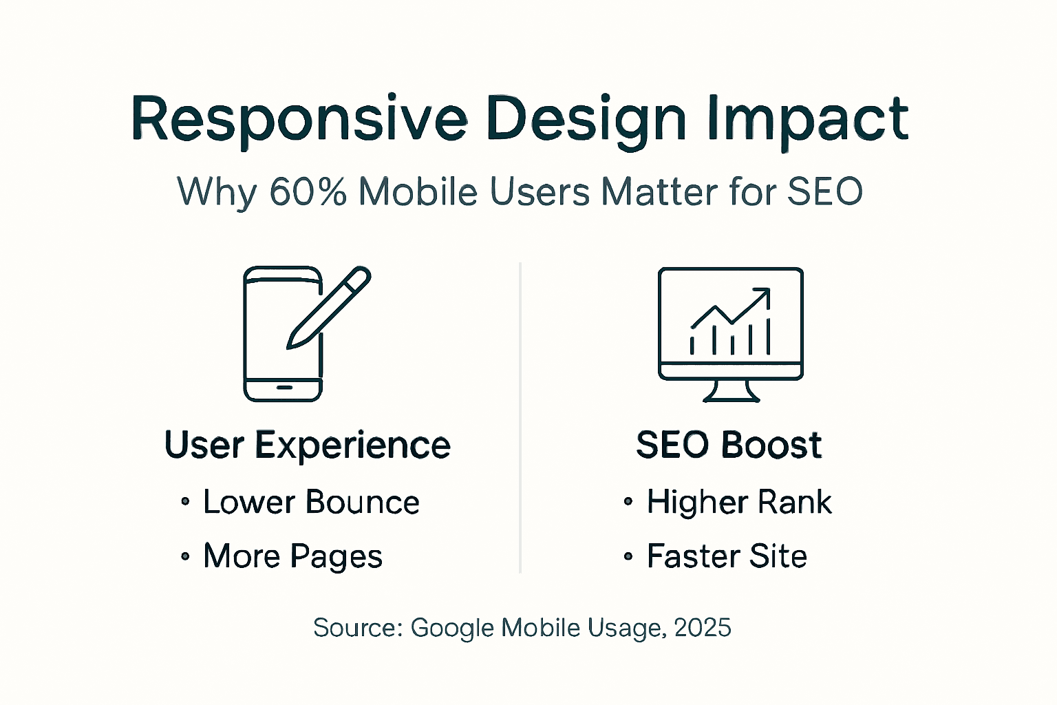
Why Responsive Design Matters for Mobile User Experience and Local SEO
Mobile devices accounted for over 60% of worldwide internet traffic in 2025, and that percentage continues climbing. In Melbourne, locals searching for emergency plumbing, electrical repairs, or professional services overwhelmingly use their phones. If your site doesn't work flawlessly on mobile, you're invisible to the majority of potential customers.

Google's mobile-first indexing prioritises responsive websites for local search ranking. This means Google predominantly uses the mobile version of your site for indexing and ranking. Sites that deliver poor mobile experiences get pushed down in search results, regardless of how good their desktop versions look. For local Melbourne businesses competing for "near me" searches, this makes responsive design directly tied to visibility and enquiry volume.
Bounce rate drops dramatically when mobile users find sites easy to navigate. A non-responsive site forces users to zoom and scroll horizontally, creating frustration that sends them back to search results within seconds. Google notices these quick exits and interprets them as signals of low-quality content, further hurting your rankings.
User experience improvements that boost both engagement and local SEO:
- Faster page loads on mobile connections keep users engaged and reduce abandonment
- Touch-friendly buttons prevent mis-clicks and frustration, encouraging deeper exploration
- Readable text without zooming makes content accessible and keeps attention focused
- Streamlined navigation helps mobile users find contact information and services quickly
- Click-to-call buttons convert interest into immediate phone enquiries
These elements combine to create mobile experiences that feel natural and effortless. Users stay longer, explore more pages, and ultimately contact you at higher rates. Google rewards these positive engagement signals with better local search positions.
For Melbourne trades and service providers, local SEO depends heavily on mobile performance. When someone searches for electricians or plumbers while standing in a hardware store, they're ready to hire immediately. Your responsive site needs to load quickly, display your phone number prominently, and make contacting you friction-free. Learn more about local SEO strategies for small business to maximise your visibility across Melbourne suburbs.
Key Statistic: Sites with responsive design see bounce rates 20-30% lower than non-responsive alternatives, directly improving conversion rates and search rankings.
Common Misconceptions About Responsive Design
Many small business owners think responsive design simply shrinks desktop layouts to fit smaller screens. This misunderstanding leads to poor decisions and wasted money. True responsive design rethinks content hierarchy, navigation patterns, and interaction methods for each device type. It's not about making things smaller but about making them work better.
Adaptive design and responsive design get confused frequently. Adaptive design creates multiple fixed layouts for specific screen sizes, detecting the device and serving the appropriate version. Responsive design uses one flexible layout that adjusts fluidly to any screen size. Responsive is generally superior because it handles the endless variety of device sizes without requiring separate codebases for each breakpoint.
Some business owners believe mobile apps replace the need for responsive websites. Apps serve specific purposes for frequent users, but most customers will never download your app. They'll find you through Google searches and visit your website first. A responsive site reaches these first-time visitors effectively, while apps create unnecessary barriers for casual users seeking information or one-time services.
Another myth suggests responsive design sacrifices desktop experience to prioritise mobile. Quality responsive design enhances all experiences. Desktop users benefit from faster load times, cleaner layouts, and better-organised content. The mobile-first planning process actually improves desktop sites by forcing designers to prioritise essential content and eliminate clutter.
Common false beliefs include:
- Responsive sites always load slowly - Properly optimised responsive sites load faster than non-responsive alternatives
- Responsive design costs significantly more - Initial investment is slightly higher, but maintaining one site costs far less than managing separate mobile and desktop versions
- Older browsers can't handle responsive design - Modern responsive frameworks include fallbacks for legacy browsers
- Responsive design limits creative freedom - It actually expands possibilities by enabling tailored experiences per device
Pro Tip: Understanding these misconceptions protects you from outdated advice and helps you evaluate web designers accurately. If a designer suggests building a separate mobile site or claims responsive design will hurt your desktop experience, they're stuck in 2010 thinking. Modern best practices favour responsive approaches exclusively. Avoiding common website mistakes starts with rejecting these myths and demanding contemporary solutions that serve your business effectively for years ahead.
Benefits of Responsive Design for User Experience and Business Performance
Page speed improves dramatically with responsive design when implemented correctly. Mobile users on cellular connections need lightweight, optimised pages. Responsive sites deliver appropriately sized images, streamlined code, and efficient layouts that load in under three seconds. This speed reduces bounce rates and keeps potential customers engaged long enough to learn about your services and contact you.
Engagement and conversion rates climb when mobile visitors can actually use your site. Readable text, accessible forms, and prominent calls to action turn casual browsers into enquiry phone calls. For Melbourne trade businesses, this means more booked jobs and higher revenue without increasing advertising spend.
Accessibility extends beyond mobile devices to include users with disabilities. Responsive design principles align naturally with accessibility best practices. Scalable text, keyboard navigation, and semantic HTML structure benefit screen reader users and those with motor impairments. This inclusive approach expands your potential customer base and demonstrates social responsibility.
Maintenance becomes significantly simpler with one responsive site instead of separate mobile and desktop versions. Content updates, security patches, and feature additions happen once and propagate everywhere. This efficiency saves ongoing costs and reduces the risk of inconsistencies between versions that confuse customers.
Key business benefits include:
- Lower bounce rates translate directly to more page views and enquiry opportunities
- Higher conversion rates mean more of your traffic turns into paying customers
- Reduced development costs from maintaining a single codebase instead of multiple versions
- Better brand consistency across all devices strengthens recognition and trust
- Future-proof flexibility adapts automatically to new devices without redesigns
- Improved analytics accuracy from tracking one site instead of separate mobile and desktop versions
These advantages compound over time. Your responsive site continues delivering value year after year, adapting to new devices and screen sizes without requiring costly updates. The initial investment pays dividends through sustained performance improvements and ongoing cost savings.
For Melbourne businesses seeking growth through digital channels, responsive design forms the foundation. It enables effective marketing, supports local SEO efforts, and converts hard-won traffic into revenue. Combining responsive design with strategic SEO maximises your return on web investment. Explore how business growth via SEO and responsive design work together to drive sustained increases in enquiries and bookings.
Real-World Examples of Responsive Design Benefits
A Melbourne electrical contractor came to us with a seven-year-old desktop-only site. Their enquiry rate had stagnated despite steady traffic because 65% of visitors were on mobile devices finding an unusable site. Three months after launching their responsive redesign, mobile enquiries jumped 47%, and overall conversion rates increased 33%.
The improvements came from specific changes. Click-to-call buttons appeared prominently on mobile layouts, eliminating the need to copy phone numbers. Service area maps loaded quickly on cellular connections. Enquiry forms auto-filled customer information, reducing friction. These targeted enhancements transformed mobile visitors from frustrated bounces into qualified leads.
Another local plumbing business saw similar results. Their old site forced mobile users to pinch and zoom to read service descriptions, creating abandonment rates above 70%. After implementing responsive design, they tracked measurable improvements:
| Metric | Before Responsive | After Responsive | Change |
|---|---|---|---|
| Mobile Bounce Rate | 71% | 43% | -39% |
| Average Session Duration | 0:42 | 2:18 | +229% |
| Mobile Enquiry Rate | 1.8% | 4.3% | +139% |
| Pages Per Session | 1.3 | 3.7 | +185% |
| Phone Call Conversions | 12/month | 34/month | +183% |
These numbers represent real revenue increases. More engaged visitors exploring multiple pages demonstrate genuine interest. Longer sessions indicate users finding the information they need. Higher conversion rates mean more booked jobs from the same traffic volume.
The investment in responsive design typically pays for itself within six months through increased enquiry volume alone. Additional benefits like improved search rankings and reduced maintenance costs extend the value indefinitely. See more responsive design success stories from Melbourne businesses across various trades and service industries.
How to Test and Maintain Your Website's Responsiveness
Regular testing ensures your responsive design continues performing as intended. Start with Google's free tools before moving to more detailed manual checks. This systematic approach catches issues before customers encounter them.
Follow these testing steps:
- Run Google Mobile-Friendly Test by entering your URL at Google's mobile testing tool to identify critical mobile usability issues
- Check browser developer tools by pressing F12 in Chrome or Firefox and toggling device emulation to view your site at various screen sizes
- Test on actual devices including phones, tablets, and different operating systems to catch real-world rendering issues tools might miss
- Verify touch targets by ensuring buttons and links are large enough to tap accurately without zooming or mis-clicking
- Measure page speed using PageSpeed Insights to confirm mobile loading times stay under three seconds
- Review content readability by checking font sizes remain legible without zooming and line lengths don't exceed comfortable reading widths
- Test forms and interactions by completing enquiry forms on mobile devices to identify friction points in your conversion funnel
Ongoing maintenance prevents responsiveness from degrading over time. Content updates, new plugins, and platform changes can introduce layout breaks. Schedule quarterly reviews to audit your entire site, paying special attention to recently updated pages.
Watch for common issues that emerge gradually:
- New images uploaded without proper optimisation break mobile layouts
- Plugin updates introduce conflicting CSS that overrides responsive styles
- Content editors paste formatted text that includes fixed widths
- Third-party widgets lack responsive design and create horizontal scrolling
Pro Tip: Set calendar reminders every three months to run comprehensive responsiveness checks. This regular schedule catches problems early before they impact many visitors. Use a testing checklist to ensure consistency. For detailed guidance, download our website responsiveness testing checklist covering every critical element.
Know when professional help makes sense. If testing reveals significant issues, attempting DIY fixes often worsens problems. Web designers understand the complex interactions between CSS, JavaScript, and content management systems. They fix issues properly the first time, preventing recurring problems. Learn about essential website management tools that simplify ongoing maintenance and keep your responsive design performing optimally.
Improve Your Business Website's Mobile Experience with Troov Marketing
You now understand why responsive design matters and how it drives better results for Melbourne small businesses. Implementing these principles effectively requires expertise in both technical execution and strategic planning. Troov Marketing specialises in building responsive websites specifically designed for local trades and service providers.
We create fast, modern websites optimised for mobile users while maintaining excellent desktop experiences. Our responsive designs load quickly on cellular connections, display your services clearly, and make contacting you effortless. Every site we build includes proper responsive implementation from day one, ensuring your investment delivers maximum value immediately.
Our approach combines small business web design services with local SEO strategy, giving you a complete digital presence that attracts Melbourne customers and converts them into enquiries. We handle the technical complexity while you focus on running your business. If your current website frustrates mobile visitors or underperforms in local searches, let's discuss how responsive design can transform your results. Contact Troov Marketing today to explore website design and local SEO services tailored specifically for Melbourne small businesses ready to grow.
What Is Responsive Design? Frequently Asked Questions
What devices does responsive design support?
Responsive design adapts to any device with a web browser, including smartphones, tablets, laptops, and desktop computers. It also works across different operating systems like iOS, Android, Windows, and macOS. The flexible approach means your site automatically adjusts to new devices released in the future without requiring updates.
How does responsive design improve local SEO specifically?
Google uses mobile-first indexing, meaning it primarily evaluates your mobile site when determining search rankings. Responsive sites deliver better mobile experiences, resulting in lower bounce rates and longer engagement times. These positive user signals tell Google your site provides valuable content, boosting your position in local search results for Melbourne-area queries.
Can I make my current website responsive without a full redesign?
It depends on your existing site's structure and how it was built. Some older sites can be retrofitted with responsive frameworks, but this often costs nearly as much as rebuilding while delivering compromised results. Modern responsive design works best when planned from the beginning, ensuring optimal performance and user experience across all devices. A professional assessment determines the most cost-effective approach for your specific situation.
How often should I test my site's responsiveness?
Test your site's mobile performance quarterly at minimum, and immediately after any significant content or design updates. New devices, browser updates, and platform changes can affect responsiveness over time. Regular testing using Google's Mobile-Friendly Test and actual devices catches issues before they impact customer experience and search rankings.
Is responsive design expensive for small businesses?
Initial development costs slightly more than desktop-only sites, but responsive design saves money long term by eliminating the need for separate mobile and desktop versions. You maintain one site instead of two, reducing ongoing costs significantly. Most Melbourne trade businesses recoup their investment within six months through increased mobile enquiries alone, making responsive design one of the most cost-effective digital marketing investments available.