
More than 60% of global web traffic now comes from mobile devices, and over half of those visitors will abandon a site that takes longer than three seconds to load. For Melbourne small businesses, that's not a minor inconvenience — it's lost revenue walking out the door. If your website isn't built to work beautifully on a smartphone, you're likely turning away the very customers you're trying to attract. This guide explains what mobile responsive design is, why it matters so much for local businesses, and how you can take practical steps to get it right.
Table of Contents
- What is mobile responsive design?
- Core principles and techniques of mobile responsiveness
- Mobile-first vs desktop-first: Which is better for your business?
- Why is mobile responsive design essential for Melbourne small businesses?
- Common challenges and how to overcome them
- Mobile responsive design in action: A business owner's checklist
- Get expert help or DIY resources for a mobile-optimised website
- Frequently asked questions
Key Takeaways
| Point | Details |
|---|---|
| Responsive design adapts for all | A responsive website automatically adjusts for mobile, tablet, and desktop visitors. |
| Mobile-first means more customers | Prioritising mobile layouts improves conversion rates and helps capture Melbourne’s mobile traffic. |
| Speed and usability boost SEO | Responsive design enhances user experience, reduces bounce, and improves Google rankings. |
| Testing and benchmarking are vital | Test on real devices and aim for benchmarks like LCP under 2.5 seconds for the best results. |
| DIY or expert help both work | Small business owners can follow checklists or seek specialist support to achieve responsive excellence. |
What is mobile responsive design?
Let's start with the basics: what mobile responsive design actually means.
Responsive web design (RWD) is a web design approach that makes web pages render well on all screen sizes and resolutions using fluid grids, flexible images, and CSS media queries. In plain English, it means your website automatically adjusts its layout, text size, and navigation to suit whatever device someone is using, whether that's a smartphone, tablet, or large desktop monitor.
This is very different from a fixed or static design, which is built for one screen size only. A fixed site might look great on a desktop but appear broken, tiny, or impossible to navigate on a phone. Responsive design removes that problem entirely.
Here's what makes a website truly responsive:
- Fluid grids: Layouts built using percentages rather than fixed pixel widths, so they scale smoothly across screen sizes.
- Flexible images: Images that resize within their containers without overflowing or distorting.
- CSS media queries: Rules that tell the browser how to display content at different screen widths.
- Consistent experience: Every visitor, on every device, gets a layout that feels intentional and easy to use.
If you want to understand the broader responsive design benefits for your business, it goes well beyond just aesthetics.
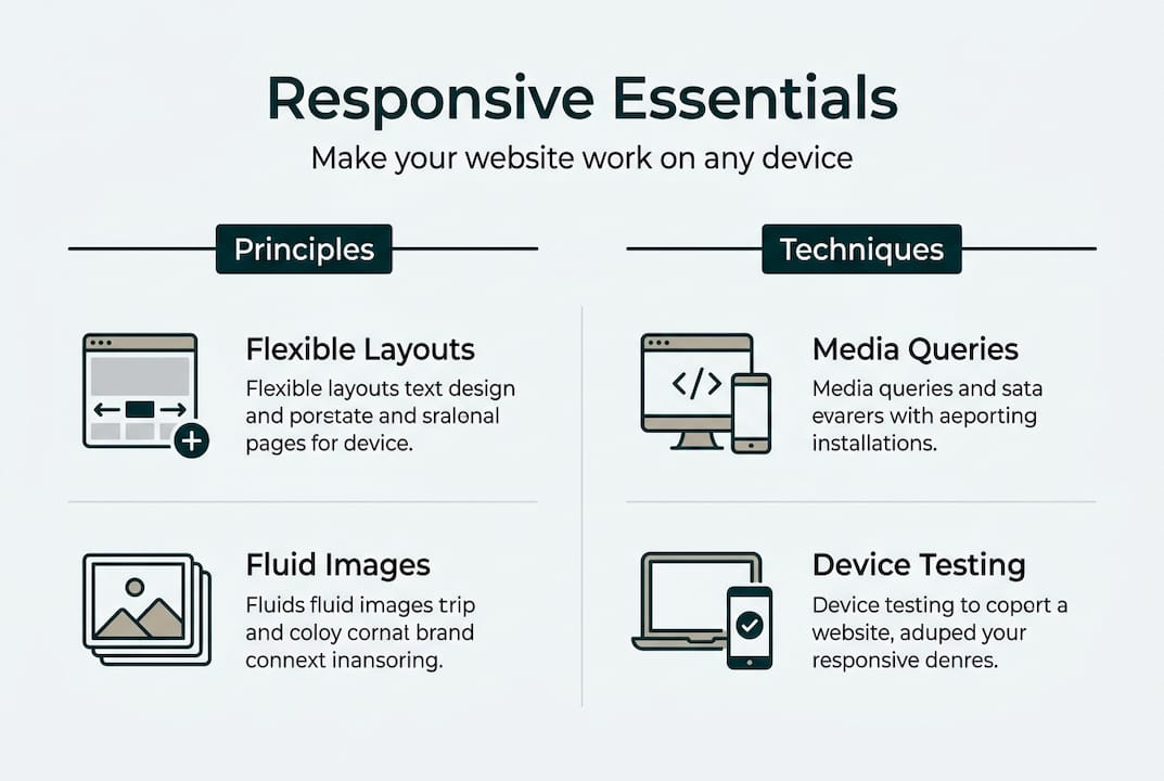
Core principles and techniques of mobile responsiveness
Now that the definition is clear, here's how mobile responsive design actually works under the hood.
There are four key building blocks that work together to create a responsive website:
- Fluid grids: Instead of setting a fixed width like 960 pixels, fluid grids use percentages. A column set to 50% will always take up half the screen, whether that screen is 320px or 1440px wide.
- Flexible images: Setting images to "max-width: 100%` in CSS ensures they never exceed their container. They shrink on small screens and expand on larger ones without losing quality.
- CSS media queries: These are the rules that activate different layouts at specific screen widths, called breakpoints. Common breakpoints include 480px for small phones, 768px for tablets, and 1024px for desktops. Fluid grids, flexible images, and CSS media queries enable layouts to adjust automatically.
- Viewport meta tag: This small but critical line of HTML code tells mobile browsers to scale the page correctly. Without it, even a well-coded responsive site can appear zoomed out and unreadable. The viewport meta tag ensures proper scaling on mobile devices and breakpoints control layout shifts.
Breakpoints should be set based on where your content naturally starts to look awkward, not just based on popular device sizes. This is a subtle but important distinction.
For a deeper look at practical mobile-friendly techniques, it helps to work through a structured approach. You can also use a website design checklist to make sure nothing gets missed.
Pro Tip: Always test your site on real physical devices, not just by resizing a browser window. Emulators are useful, but real devices reveal touch interaction issues and rendering quirks that simulators often miss.
Mobile-first vs desktop-first: Which is better for your business?
Understanding overall approaches is vital, so let's compare mobile-first and desktop-first strategies.
| Approach | Starting point | Performance on mobile | Complexity |
|---|---|---|---|
| Mobile-first | Small screens | Faster, leaner code | Builds up progressively |
| Desktop-first | Large screens | Can be slower, heavier | Scales down, often messier |
Mobile-first means you design and code for the smallest screen first, then add features and layout complexity as the screen gets larger. This is called progressive enhancement. Mobile-first progressive enhancement is preferred for performance and aligns with mobile traffic dominance.
Desktop-first starts with a full desktop layout and then strips things back for smaller screens. This approach often results in heavier pages on mobile because the browser still loads desktop assets before scaling them down.
For Melbourne small businesses, mobile-first is almost always the better choice. Here's why:
- Most of your local customers are searching on their phones.
- Mobile-first sites load faster, which directly reduces bounce rates.
- Google uses mobile-first indexing, meaning it primarily looks at your mobile site when deciding rankings.
- A mobile-first website approach sets you up for stronger local search visibility from day one.
"The best time to think about mobile is before you build, not after. Starting mobile-first means every decision you make is grounded in how most of your customers will actually experience your site."
Why is mobile responsive design essential for Melbourne small businesses?
But why should Melbourne small business owners care? Here's what happens when your site is, or isn't, responsive.
The numbers are hard to ignore. Responsive design reduces bounce rates by 20 to 30%, mobile-first approaches boost conversions by 15 to 35%, and Core Web Vitals pass rates sit at 43% on mobile versus 53% on desktop. That gap represents a real opportunity for businesses willing to invest in getting mobile right.
Here's what a responsive website does for your business:
- Keeps visitors on your site longer: When your layout works on a phone, people stay and explore rather than bouncing straight back to Google.
- Boosts local search rankings: Google prioritises mobile-friendly sites in local search results, which is critical when someone searches "plumber near me" or "cafe in Fitzroy."
- Builds trust instantly: A site that looks polished on mobile signals professionalism. A broken layout does the opposite.
- Increases enquiries and conversions: Easier navigation means visitors are more likely to call, book, or fill out a contact form.
The responsive design advantages for local businesses are well documented, and the connection between a well-built site and local SEO for Melbourne businesses is direct and measurable.

Common challenges and how to overcome them
Even with the best intentions, there are practical hazards and edge cases to address. Here's how to handle them.
Mobile design introduces challenges that simply don't exist on desktop. Touchscreens require larger touch targets, hover effects don't work on mobile, and images need to be optimised for low-bandwidth connections. New device types like foldables add further complexity.
Here's how to tackle the most common issues:
- Button and link sizing: Make tap targets at least 44x44 pixels. Small buttons frustrate users and lead to accidental taps.
- Avoid hover-only interactions: Any feature that only activates on mouse hover will be invisible to mobile users. Use tap-friendly alternatives.
- Image optimisation: Compress images and use lazy loading so they only load when needed. This dramatically improves page speed on mobile networks.
- Test across orientations: Check your site in both portrait and landscape mode. Layouts that work in portrait can break when a phone is rotated.
- Account for new devices: Foldable phones and tablets with unusual aspect ratios are increasingly common. Flexible layouts handle these better than fixed ones.
Avoid the website design mistakes that quietly cost small businesses customers every day. For a deeper look at responsive design pitfalls, there are Melbourne-specific examples worth reviewing.
Pro Tip: Run your site through Google's free Lighthouse tool or PageSpeed Insights. These tools measure Core Web Vitals including LCP (Largest Contentful Paint) and INP (Interaction to Next Paint) on mobile, giving you a clear picture of where to focus your efforts.
Mobile responsive design in action: A business owner's checklist
With all this knowledge, here's a checklist so you can take action straight away.
Start with these diagnostics and improvements:
- Open your site on your phone and scroll through every page. Note anything that looks broken, overlaps, or requires horizontal scrolling.
- Run a PageSpeed Insights test on your homepage. Aim for an LCP under 2.5 seconds and an INP under 200 milliseconds. Benchmarks of LCP under 2.5s and INP under 200ms are the current industry standard.
- Check your images are compressed and using modern formats like WebP where possible.
- Review your buttons and forms on mobile. Can you tap them easily with your thumb? Do forms auto-fill correctly?
- Test in both orientations on at least two different devices.
- Check your Google Search Console for mobile usability errors under the Experience section.
| Action | Expected outcome |
|---|---|
| Compress and lazy-load images | Faster load times, lower bounce rate |
| Fix tap target sizes | Fewer frustrated users, more conversions |
| Add viewport meta tag | Correct scaling on all mobile devices |
| Set responsive breakpoints | Clean layout across phones and tablets |
| Pass Core Web Vitals on mobile | Better Google rankings, improved user experience |
If you're ready to build a mobile-friendly website from the ground up, or need to audit your existing one, addressing common website mistakes early saves significant time and money later.
Get expert help or DIY resources for a mobile-optimised website
Mobile responsive design is one of the most important investments you can make in your digital storefront, but you don't have to figure it all out on your own. At Troov Marketing, we work with Melbourne small businesses to build fast, modern websites that are responsive from the ground up and structured to support local SEO from day one. Whether you're starting fresh or improving an existing site, our professional web design support is tailored to your business goals. If you prefer to start with a self-audit, our free website build checklist walks you through every key element to check. Either way, the next step is closer than you think.
Frequently asked questions
How do I check if my website is mobile responsive?
Open your site on a smartphone and look for horizontal scrolling, overlapping text, or broken layouts. You can also use Google's Mobile-Friendly Test tool, which checks whether media queries and fluid layouts are working correctly.
Does mobile responsive design improve Google rankings?
Yes. Google uses mobile-first indexing, so mobile-friendly sites improve local SEO and rank higher in search results, particularly for location-based queries that matter most to Melbourne businesses.
What's the difference between mobile responsive and mobile-friendly?
Mobile responsive means your site adapts layout and content fluidly to any screen size. Mobile-friendly is a broader term that sometimes just means a site doesn't break on mobile, without necessarily optimising the layout or navigation for smaller screens.
Do I need advanced web skills to make my site responsive?
Not always. Many website platforms offer responsive templates that handle the basics automatically. However, fixing specific layout issues or implementing fluid grids and CSS media queries properly usually benefits from a developer's input.