
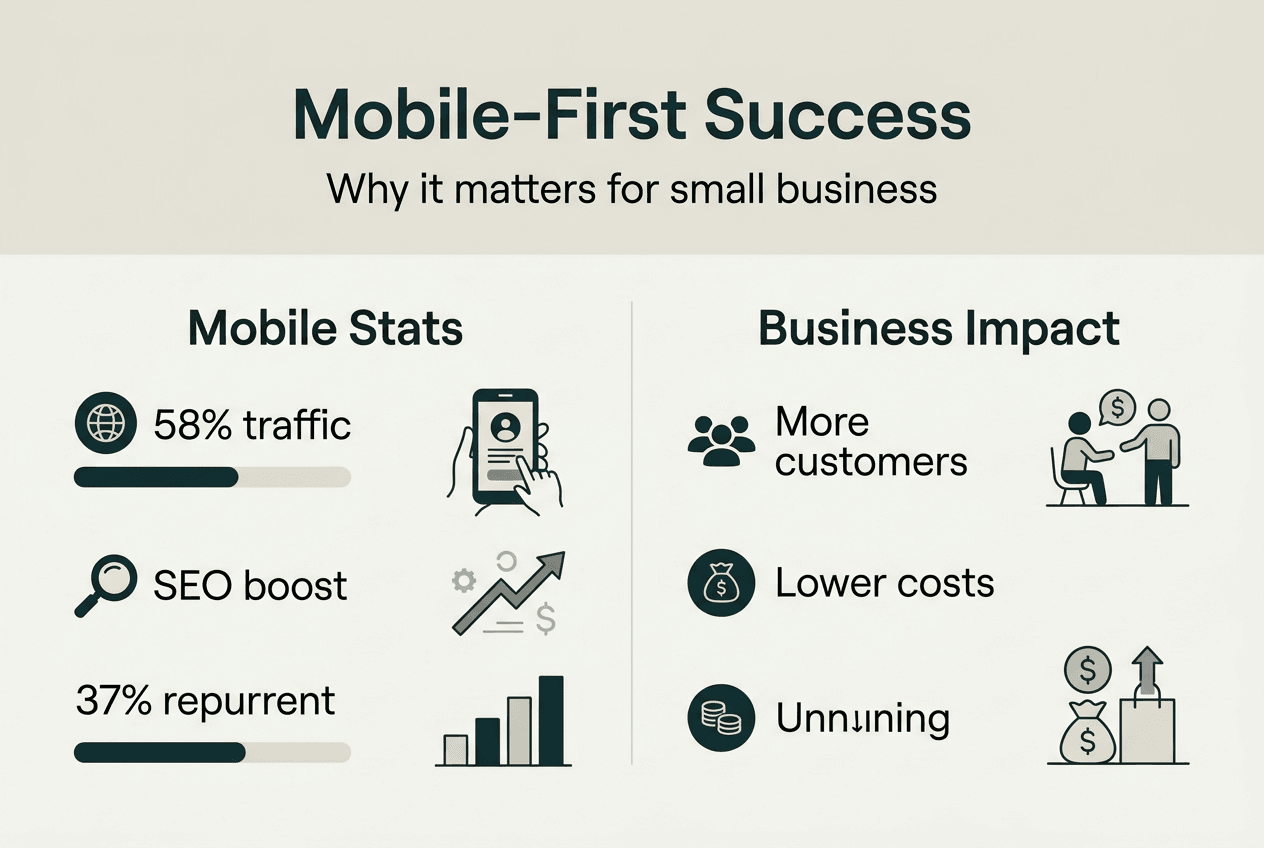
Over 58% of global web traffic now comes from mobile devices, yet many Melbourne small business owners still design their websites with desktop users as the primary focus. This approach misses a critical opportunity. Mobile-first websites aren't just about making your site look good on smartphones. They're about meeting your customers where they already are, improving your Google rankings through mobile-first indexing, and creating seamless experiences that turn visitors into paying customers. For Melbourne businesses competing in local search, understanding mobile-first design is no longer optional.
Table of Contents
- The Rise Of Mobile Traffic And What It Means For Your Business
- What Mobile-First Website Design Actually Means
- Benefits Of Mobile-First Websites For Melbourne Small Businesses
- Common Pitfalls Of Neglecting Mobile-First Design And How To Avoid Them
- Boost Your Melbourne Business With Expert Mobile-First Web Design
- Frequently Asked Questions
Key takeaways
| Point | Details |
|---|---|
| Mobile traffic dominance | Mobile devices generate 58% of global web traffic, making mobile-first design essential for reaching customers. |
| Google's mobile-first indexing | Search rankings now prioritise mobile site quality, directly affecting your visibility in local searches. |
| Cost efficiency | Responsive mobile-first design costs 65% less than maintaining separate mobile sites. |
| Enhanced user experience | Mobile-first websites load faster, navigate easier, and convert better on smartphones. |
| Local SEO advantage | Mobile-optimised sites rank higher in location-based searches, capturing on-the-go customers effectively. |
The rise of mobile traffic and what it means for your business
The shift to mobile isn't coming. It's already here. Mobile traffic represents a significant portion of global web usage, with smartphones accounting for 58% of all web visits worldwide. For Melbourne small businesses, this statistic carries profound implications. Your potential customers are searching for local services, comparing options, and making purchasing decisions while standing in line, commuting on the tram, or sitting in a cafe.
Consumers rely on their smartphones to find local businesses instantly. Someone searching for a plumber in Brunswick or a cafe in Fitzroy expects immediate results on a screen they can hold in one hand. If your website doesn't load quickly or requires pinching and zooming to read, you've lost that customer before they've even seen your services. Ignoring mobile users means abandoning a massive segment of your potential market.
Mobile-first design flips the traditional approach. Instead of building for desktop computers and then squeezing everything onto smaller screens, you start with the mobile experience. You prioritise what matters most on a 6-inch display, then enhance the design as screen size increases. This methodology forces clarity and focus.
Mobile devices vary dramatically in screen sizes, processing power, and usage contexts. A customer might browse your site on a train with spotty reception or while walking down Chapel Street. Your website must adapt to these real-world conditions.
The mobile dominance affects more than user convenience. It directly impacts your search engine rankings and local visibility. Google's algorithms now evaluate your mobile site first when determining where you appear in search results. A clunky mobile experience doesn't just frustrate users. It actively pushes your business down in search rankings, making you harder to find when local customers need you most.
Understanding responsive design and mobile usability helps Melbourne businesses create websites that work seamlessly across all devices. The technical foundation matters, but the real benefit comes from meeting customer expectations in an increasingly mobile world.
What mobile-first website design actually means
Mobile-first design is a strategic approach, not just a technical checkbox. Mobile-first planning involves designing for the smallest screens first, then progressively enhancing the experience for tablets, laptops, and desktop computers. This inverted process forces you to identify your most critical content and functionality upfront.
Responsive design ensures your site adapts fluidly to varied device sizes and orientations. When someone rotates their phone from portrait to landscape, your layout adjusts automatically. When they switch from a smartphone to a tablet, the design scales appropriately without requiring a separate mobile site. This flexibility creates consistency across every touchpoint.
Traditional desktop-first design creates problems that become obvious only after launch. You might build a beautiful website on a 27-inch monitor, then discover the navigation menu doesn't work on a phone. Buttons might be too small to tap accurately. Images might take forever to load on mobile data. Text might be unreadable without zooming. Fixing these issues after the fact costs time and money.

Mobile-first design improves loading times by prioritising essential content and deferring non-critical elements. It considers touch interactions from the start, ensuring buttons are large enough to tap and menus are easy to navigate with thumbs. Navigation becomes simpler and more intuitive because you can't hide complexity behind hover states that don't exist on touchscreens.
Here's how to implement mobile-first thinking effectively:
- Identify your core content and primary user goals before designing anything
- Sketch mobile layouts first, focusing on vertical scrolling and thumb-friendly interactions
- Test early prototypes on actual smartphones, not just browser emulators
- Add complexity and features only as screen size increases
- Validate loading speed on 3G and 4G connections, not just office WiFi
Pro Tip: Prioritise content and functionality critical on mobile to streamline user experience. Ask yourself what a customer standing outside your competitor's shop needs to see within three seconds. That's what belongs above the fold on mobile.
Exploring expert mobile design tips reveals practical strategies for creating websites that convert visitors into customers across all devices. The mobile-first approach isn't about limiting your desktop site. It's about ensuring your mobile site doesn't feel like an afterthought.
Benefits of mobile-first websites for Melbourne small businesses
Mobile-first websites deliver measurable advantages that directly impact your bottom line. Google prioritises mobile-first indexing for search rankings, meaning your mobile site quality determines where you appear in local search results. For Melbourne businesses competing for 'plumber near me' or 'best cafe in Carlton' searches, this makes mobile optimisation critical for visibility.
Cost savings matter to small business owners operating on tight budgets. A single responsive site costs significantly less than maintaining separate mobile sites, with responsive mobile-first designs costing roughly 65% less than building and updating multiple versions. You maintain one codebase, update content once, and serve all devices from a single platform.
Better user experience translates directly to business results. Mobile-first websites load faster, reducing bounce rates that kill conversions. When customers can easily find your phone number, read your services, and contact you without frustration, they're more likely to choose your business over competitors. Trust builds when your digital presence feels professional and modern.
Mobile-first design helps Melbourne small businesses capture on-the-go customers effectively. Someone searching for emergency services or last-minute bookings expects immediate answers. Your mobile site becomes your most important salesperson, working 24/7 to convert interest into enquiries.
| Feature | Desktop-first approach | Mobile-first approach |
|---|---|---|
| Design priority | Large screens, then adapt down | Small screens, then enhance up |
| Loading speed | Often slow on mobile | Optimised for mobile data |
| User experience | Touch interactions added later | Touch-friendly from start |
| SEO impact | May hurt mobile rankings | Improves search visibility |
| Maintenance cost | Higher with separate mobile site | Lower with responsive design |
| Local search performance | Inconsistent mobile experience | Better 'near me' search results |
Pro Tip: Ensure your website's local SEO is optimised alongside mobile-first design for maximum benefit. Technical excellence means nothing if customers can't find you in the first place.
Understanding the professional web design benefits available to Melbourne businesses reveals how mobile-first thinking integrates with broader digital strategy. The competitive edge comes from combining technical best practices with deep understanding of local customer behaviour.
Common pitfalls of neglecting mobile-first design and how to avoid them
Many Melbourne businesses unknowingly sabotage their mobile presence through preventable mistakes. Performance issues like slow loading images frustrate mobile users who expect instant results. When your homepage takes eight seconds to load on 4G, potential customers have already moved to your competitor's site. Compress images, lazy load non-critical content, and test loading speed on actual mobile connections.
Navigation must be consistent and easy to use on small screens. Dropdown menus that work beautifully with a mouse often fail on touchscreens. Hamburger menus need clear labels and smooth animations. Critical actions like 'Call Now' or 'Get Quote' should be immediately accessible, not buried three taps deep in a confusing menu structure.
Horizontal scrolling diminishes usability and should be eliminated entirely. If users must swipe sideways to read text or see full images, your responsive design has failed. Content should flow vertically, adapting to screen width automatically. This seems obvious, yet countless small business websites still force horizontal scrolling on mobile devices.
Ignoring touch interactions leads to poor user experience on mobile. Buttons need adequate spacing to prevent accidental taps. Interactive elements should be at least 44 pixels tall to accommodate average finger size. Forms should use appropriate input types that trigger the right mobile keyboards. These details seem minor but compound into frustration.
Avoid performance neglect, inconsistent navigation, horizontal scrolling, slow loading images, ignored touch interactions, fixed width elements, and a desktop-first approach. Each mistake chips away at user trust and search rankings.
Fixed width elements often break layouts on varied device sizes. Setting a container to 1200 pixels wide works fine on desktop but creates horizontal scrolling nightmares on smartphones. Use flexible units like percentages or viewport widths that adapt to available screen space. Modern CSS frameworks handle this automatically, but many older websites still use rigid layouts.
Desktop-first design overlooks mobile user needs and behaviours fundamentally. Desktop users might tolerate complex navigation and dense information. Mobile users want answers fast. They're often multitasking, dealing with distractions, or making quick decisions. Your mobile site must respect these constraints.
Recognising common website mistakes to avoid helps Melbourne businesses identify problems before they damage customer relationships and search rankings. Prevention costs less than fixing issues after launch, and the opportunity cost of lost customers adds up quickly.
Boost your Melbourne business with expert mobile-first web design
Troov Marketing specialises in mobile-first web design tailored for Melbourne small businesses who need websites that work as hard as they do. We understand the local market, from Brunswick tradie businesses to Southbank professional services, and we build sites that capture the unique character of Melbourne's diverse business landscape while delivering technical excellence.
Our comprehensive support includes design, optimisation, and local SEO training that helps you maintain and grow your online presence over time. We don't just hand you a website and disappear. We ensure you understand how to update content, track performance, and make data-driven decisions that improve results.
Pro Tip: Use Troov's ultimate website checklist to ensure your site meets mobile-first and SEO best practices before launch and during regular audits.
Partner with local experts who understand Melbourne market and user behaviour. We've helped businesses across Melbourne improve their online visibility through combining website design and local SEO strategies that deliver measurable results. Explore our expert mobile design tips to see how we approach projects differently.
Frequently asked questions
What is a mobile-first website?
A mobile-first website is designed starting with mobile devices in mind, ensuring optimal usability and performance on small screens before expanding to larger displays. This approach prioritises the most critical content and functionality, creating streamlined experiences that work flawlessly on smartphones. The design then progressively enhances as screen size increases, adding features and complexity appropriate for tablets and desktops. Understanding mobile optimisation benefits helps small businesses recognise why this approach improves both user experience and search rankings.
Why does Google prioritise mobile-first indexing?
Google ranks websites based on their mobile version content since most users search via mobile devices now. Mobile-first indexing means your mobile site quality directly affects your search rankings across all devices. If your mobile site loads slowly, has poor navigation, or lacks important content, your entire website suffers in search results. This shift reflects how people actually use the internet today, with smartphones becoming the primary access point for online information and services.
How can a mobile-first website improve my local business in Melbourne?
Mobile-first websites load faster and provide better navigation, attracting local customers who search on smartphones while moving through Melbourne. They improve your Google rankings for 'near me' and other location-based searches that drive foot traffic and enquiries. Enhanced mobile user experience leads to higher leads and sales locally because customers can easily find your contact details, view your services, and take action without frustration. Implementing small business SEO in Melbourne alongside mobile-first design creates a powerful combination for local visibility.
How much does mobile-first website design cost compared to traditional approaches?
Mobile-first responsive design typically costs 65% less than building and maintaining separate mobile and desktop sites. You invest in one website that adapts to all devices, reducing development time, ongoing maintenance, and content management complexity. The initial investment might seem similar to desktop-first design, but the long-term savings and improved performance make mobile-first the more economical choice. Factor in better search rankings and higher conversion rates, and the return on investment becomes even clearer for Melbourne small businesses.
What are the most important mobile-first design elements for small business websites?
Fast loading speed tops the list, as mobile users abandon slow sites within seconds. Clear, thumb-friendly navigation ensures customers can find information easily on small screens. Prominent contact buttons let customers call or email with one tap. Readable text without zooming and properly sized touch targets prevent frustration. Vertical scrolling layouts that avoid horizontal scrolling create natural browsing patterns. These elements combine to create mobile experiences that convert visitors into customers rather than sending them to competitors with better mobile sites.