
TL;DR:
- Mobile-first design enhances user experience and improves local SEO rankings for Melbourne businesses.
- Building responsive sites involves planning layouts, using flexible grids, images, and testing on real devices.
- Continuous testing and focusing on customer needs are crucial beyond just technical responsiveness.
Most Melbourne customers reach for their phone before they reach for their laptop. If your website isn't built to handle that moment well, you're likely losing enquiries before anyone even reads your services page. A clunky, slow, or hard-to-navigate mobile experience sends visitors straight to a competitor. The good news is that building a mobile responsive website doesn't have to be overwhelming. This guide walks you through a practical, step-by-step workflow that improves customer engagement, strengthens your user experience, and gives your local SEO the solid foundation it needs to perform.
Table of Contents
- Understanding the mobile responsive workflow
- Essential tools and prerequisites for a mobile-first build
- Step-by-step: Building your mobile responsive site
- Testing, troubleshooting and refining for the real world
- What most guides miss about mobile responsive workflows
- Get expert help for a truly mobile-responsive website
- Frequently asked questions
Key Takeaways
| Point | Details |
|---|---|
| Prioritise mobile-first | Starting your workflow with mobile layouts gives you the best customer engagement and SEO results. |
| Use flexible frameworks | Fluid grids, flexible images, and modular components make your site adapt perfectly to any device. |
| Test on real devices | Checking your site on actual mobiles ensures what you build works for real Melbourne customers. |
| Avoid common mistakes | Stay clear of fixed pixel units, over-complicated hamburger menus, and neglecting accessibility from the start. |
Understanding the mobile responsive workflow
A workflow in the context of responsive web design is simply the sequence of decisions and actions you take to build a site that looks and works well across all screen sizes. It's not just about making things fit on a small screen. It's about designing with mobile users in mind from the very start, then layering in more complex layouts as screen sizes grow.
This approach is called mobile-first design. Rather than building a desktop site and shrinking it down, you begin with the smallest screen and progressively enhance using min-width media queries as screens get larger. Google uses mobile-first indexing, which means it primarily looks at your mobile site when deciding how to rank you. For Melbourne small businesses, this is critical. Local searches like "plumber near me" or "café in Fitzroy" happen overwhelmingly on phones, and mobile-first design directly supports your visibility in those results.
Here's a simple checklist of what a solid mobile responsive workflow covers:
- Design system: Consistent colours, fonts, spacing, and components that scale across breakpoints
- Mobile layout first: Start at 320px width and build outward
- Breakpoints: Set at natural content-break points, not just common device sizes
- Flexible images: Images that resize within their containers without distorting
- Performance targets: Fast load times on mobile networks
Understanding why mobile-first websites benefit small businesses goes beyond just rankings. A well-structured mobile site builds trust, reduces bounce rates, and makes it easier for customers to contact you. The Melbourne small business design guide covers this in more detail if you want to explore further.
Pro Tip: Resizing your browser window is not a reliable test for mobile responsiveness. Real devices behave differently. Always test on an actual phone before you consider a layout finished.
Essential tools and prerequisites for a mobile-first build
Before you start building, it pays to gather the right tools and understand what's involved. You don't need to be a developer to manage a mobile-first project, but you do need a clear picture of your platform, your assets, and your approach.
The core methodologies you'll rely on include fluid grids, flexible images, container queries, and clamp for fluid typography. These aren't just technical buzzwords. They're the building blocks that make a site adapt naturally to any screen without breaking.
Here's what you'll want in place before you begin:
- A chosen platform or framework (see comparison below)
- A set of mobile-ready design assets (logo, images, icons)
- Your copy written with short paragraphs and clear headings
- Access to a real mobile device for testing
- Basic familiarity with how your platform handles layout
| Platform | Mobile-first support | Ease of use | Custom control | Best for |
|---|---|---|---|---|
| WordPress | Good with right theme | Moderate | High | Businesses wanting flexibility |
| Webflow | Excellent | Moderate | Very high | Design-focused builds |
| Wix | Moderate | Easy | Low | Simple, fast setups |
| Custom HTML/CSS | Full control | Requires skill | Complete | Developers or agencies |
Accessibility is also a prerequisite, not an afterthought. Your mobile site should be readable by screen readers, have sufficient colour contrast, and use descriptive link text. These factors also contribute to SEO performance.

For a broader look at website design best practices that apply across platforms, it's worth reviewing what works before you commit to a build approach. You can also use the complete website checklist to make sure nothing important gets missed before launch.
Pro Tip: Write and finalise all your copy in a mobile layout first. Long paragraphs and dense text that look fine on a desktop become walls of text on a phone. Shorter sentences and clear headings make a huge difference to readability on small screens.
Step-by-step: Building your mobile responsive site
With your tools assembled, follow these steps to build out your responsive site in a logical, efficient sequence.
-
Plan your mobile layout. Sketch or wireframe the mobile version of every key page before touching any code or page builder. Decide what content is essential and what can be deprioritised on small screens.
-
Build the fluid structure. Use CSS Grid or Flexbox to create layouts that stretch and compress naturally. Avoid fixed pixel widths for containers. Use percentage-based or fr units so columns adapt to the screen.
-
Add flexible images. Set images to "max-width: 100%` so they never overflow their containers. Use modern formats like WebP for faster load times on mobile networks.
-
Set breakpoints based on content. Rather than targeting specific devices, add breakpoints where your layout starts to look awkward. Progressive enhancement with min-width queries at content-driven points (commonly around 768px for tablets and 1024px for desktops) keeps your layout clean and predictable.
-
Apply progressive enhancement. Add complexity as screen size grows. Features like multi-column layouts, hover effects, and larger imagery should layer on top of a solid mobile base, not the other way around.
A few technical details worth keeping in mind:
- Use rem and em units rather than px for font sizes and spacing. This respects user browser settings and scales more predictably. Rem/em over px is a widely accepted best practice for accessible, responsive typography.
- Keep touch targets at a minimum of 44px in height and width. Buttons and links that are too small frustrate users and increase bounce rates.
- Use clamp() for fluid typography so text scales smoothly between screen sizes without needing multiple breakpoints just for font sizes.
For a more detailed walkthrough of mobile-friendly design steps, including visual examples, that resource is a useful companion to this guide.
Avoid the common shortcuts that cause problems later: fixed-width containers, pixel-based font sizes, and images without defined dimensions. These choices seem harmless early on but create layout breaks and slow load times that hurt your user experience and your rankings.
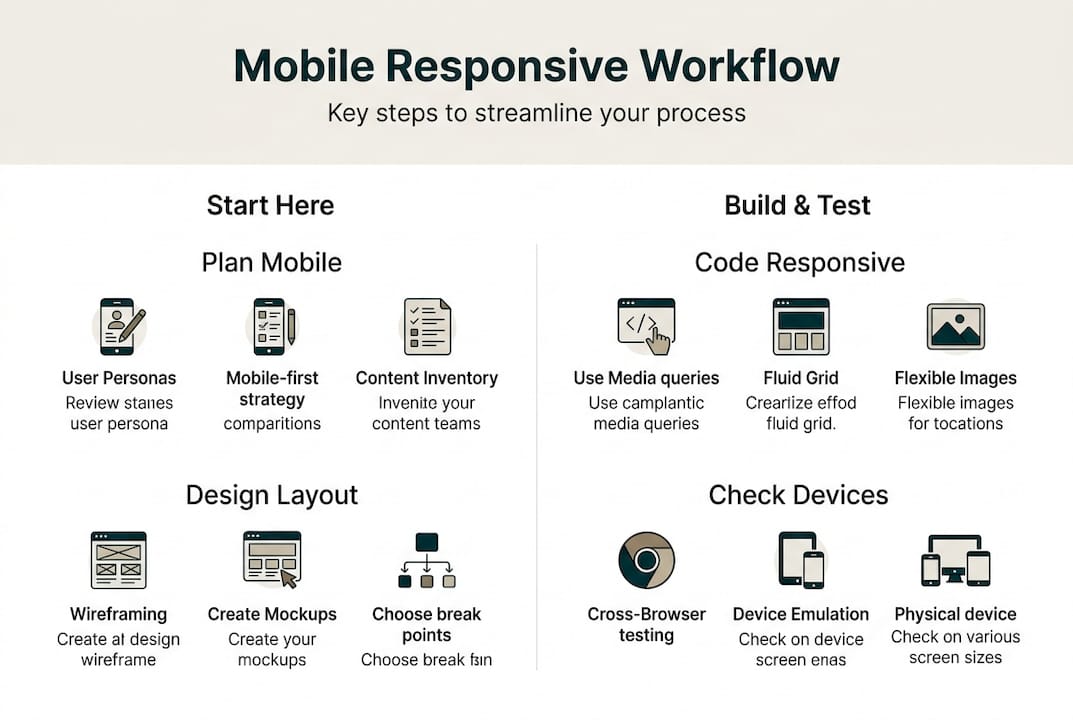
Testing, troubleshooting and refining for the real world
After building your site, it's vital to subject it to real-world testing and continuous improvement. A site that looks perfect in your browser can still fail in ways that cost you customers.
Here are the most important testing actions to take before and after launch:
- Test on real devices: Use actual phones and tablets, not just browser developer tools
- Check screen rotation: Landscape mode often breaks layouts that look fine in portrait
- Simulate slow connections: Use browser throttling to see how your site performs on a 3G or 4G connection
- Run accessibility checks: Tools like Lighthouse or WAVE flag contrast issues, missing alt text, and keyboard navigation problems
- Test across browsers: Safari on iOS behaves differently from Chrome on Android
As one widely cited warning puts it:
This is especially relevant for Melbourne businesses serving customers on the move. A slow site on a patchy mobile connection is a lost enquiry.
Pro Tip: Ask a real customer or someone unfamiliar with your business to navigate your site on their phone while you watch. You'll learn more in five minutes than from any automated tool.
The top three pitfalls that hurt mobile sites in practice are overloaded homepages with too many elements, navigation menus that are hard to tap, and images that slow the page to a crawl. Each of these directly affects how long visitors stay and whether they contact you.
For further reading on avoiding costly web mistakes that affect small business sites, that guide covers the most common and expensive errors in detail. If you're also building an online store, the mobile workflow testing insights from ecommerce builds apply directly to responsiveness challenges.
Iterate based on what you find. Testing is not a one-time task. As you add new pages, update content, or change your layout, re-test on mobile to make sure nothing has broken.
What most guides miss about mobile responsive workflows
Most technical guides focus heavily on tools, frameworks, and checklists. That's useful, but it misses something important: the gap between a technically responsive site and one that actually works for your specific customers.
We've seen Melbourne small business owners invest time into DIY site builders, follow every best-practice checklist, and still end up with a site that underperforms. Why? Because the template was built for a generic audience, the content wasn't written for mobile reading habits, and no one tested it with real local users.
The uncomfortable truth is that responsiveness is a starting point, not a finish line. A site that passes technical tests can still feel clunky, load slowly on Melbourne's suburban mobile networks, or fail to communicate what makes your business worth choosing. Integrating website and local SEO from the start, rather than bolting it on later, is what separates sites that generate enquiries from those that just exist online.
Focus on your real customers, not just your screen sizes.
Get expert help for a truly mobile-responsive website
Building a mobile responsive site is achievable, but getting every detail right takes time and experience. At Troov Marketing, we design and build websites for Melbourne small businesses that are fast, easy to manage, and structured for local SEO from day one. If you're ready to move beyond templates and build something that genuinely works for your customers, explore our mobile-responsive web design solutions. You can also learn how we approach web design and SEO as a combined strategy, or download our website optimisation checklist to review where your current site stands.
Frequently asked questions
What are the essential steps in a mobile responsive website workflow?
A mobile responsive workflow starts with planning your mobile layout first, then building with fluid grids and flexible images, adding content-driven breakpoints, and testing regularly on real devices throughout the process.
Why is mobile-first design important for Melbourne small businesses?
Mobile-first design improves your Google ranking through mobile indexing, speeds up your site for local users on the go, and boosts customer engagement when people search for your services from their phones.
How do I test my website for full mobile responsiveness?
Test on real mobile devices across multiple browsers, check both portrait and landscape orientations, and use slow network simulations to see how your site performs under realistic conditions.
What tools help create a mobile responsive site easily?
Platforms like WordPress or Webflow, combined with CSS grid and flexbox frameworks and browser-based testing tools, give you a strong foundation for building and refining a mobile-first site.