
TL;DR:
- Mobile optimization is essential for visibility and client engagement in Melbourne gardening businesses.
- Building a responsive, fast-loading mobile site improves search rankings and user experience.
- Regular testing and adhering to SEO best practices help maintain optimal mobile performance and attract local clients.
Most Melbourne gardeners focus on the quality of their work, not their website. But here's the reality: if your site isn't built for mobile, Google may never show it to local clients searching for a gardener right now. Mobile-first indexing means Google ranks your site based on how it performs on a phone, not a desktop. That's a significant shift, and many gardening businesses haven't caught up. In this article, we'll walk you through why mobile optimisation matters, what a well-built mobile site looks like, and the practical steps you can take to attract more Melbourne clients online.
Table of Contents
- Why mobile optimisation matters for Melbourne gardeners
- Core principles of mobile-friendly gardening websites
- Essential mobile SEO tactics for garden business owners
- Quick-win tools and optimisation processes for local gardeners
- What most gardening websites get wrong about mobile optimisation
- Get expert help with mobile optimisation for your gardening business
- Frequently asked questions
Key Takeaways
| Point | Details |
|---|---|
| Mobile-first is critical | Google ranks gardening websites using their mobile versions, directly impacting visibility. |
| Responsive design wins | A site that adapts smoothly to all devices is the gold standard for attracting Melbourne clients. |
| Speed drives engagement | Fast-loading pages and compressed images help keep visitors on your site and boost enquiries. |
| Avoid hidden SEO pitfalls | Blocking mobile resources or using pop-ups can tank your search rankings and frustrate clients. |
| Tools make it easier | Free tools like PageSpeed Insights help gardeners quickly spot and fix mobile issues for better results. |
Why mobile optimisation matters for Melbourne gardeners
More people than ever are searching for local services on their phones. When someone in Fitzroy or Footscray needs a gardener, they're not sitting at a desktop. They're searching on the go, often while standing in their backyard. If your website doesn't load quickly or display properly on a small screen, that potential client will simply move on to a competitor who does.
Google's approach to ranking websites has reinforced this shift. Google uses mobile-first indexing, meaning your site is evaluated and ranked based on its mobile version. If your mobile site is slow, hard to navigate, or missing key content, your search ranking takes a hit, regardless of how polished your desktop version looks.
For Melbourne gardeners, this has a very direct impact. Local searches like "garden maintenance Melbourne" or "lawn mowing near me" are dominated by businesses with fast, mobile-friendly websites. If your site isn't one of them, you're invisible to a large portion of your target audience. Understanding why gardeners need websites that perform well on mobile is the first step toward fixing that.
Here's what poor mobile performance can cost you:
- Lost enquiries: Visitors who can't easily tap a phone number or contact form will leave without getting in touch.
- Lower search rankings: Google deprioritises sites that perform poorly on mobile, reducing your visibility in local results.
- Damaged trust: A clunky, slow site signals to potential clients that your business may not be professional or reliable.
- Missed bookings: If your booking or quote request process isn't mobile-friendly, clients abandon it mid-way.
The good news is that mobile optimisation isn't reserved for large businesses with big budgets. With the right approach, any Melbourne gardener can build a site that performs well on phones and wins more local work.
Core principles of mobile-friendly gardening websites
Building a mobile-friendly site starts with understanding what Google recommends and what your clients actually need when they visit on a phone. There are a few core principles every gardening website should follow.
1. Use responsive design
Responsive web design is Google's recommended configuration for mobile websites. A responsive site uses a single URL and adapts its layout automatically depending on the screen size. This is far simpler to manage than maintaining a separate mobile site, and it avoids common SEO issues like duplicate content.
2. Keep your layout touch-friendly
Buttons and links need to be large enough to tap comfortably with a finger. Tiny text links frustrate users and increase bounce rates. Your phone number should be a tappable link so clients can call you directly from the page.

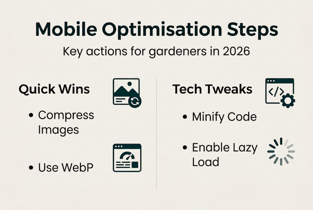
3. Compress your images
Garden websites often feature beautiful photography, but large image files slow your site down dramatically on mobile. Compressing images before uploading them is one of the fastest ways to improve load speed.
4. Prioritise fast-loading content
Load the most important content first. Clients want to see your services and contact details immediately, not wait for a decorative animation to finish.
5. Test regularly with free tools
Google Search Console and PageSpeed Insights are both free and give you clear data on how your site performs on mobile. Use them monthly to catch issues early.
Here's a quick comparison to help you understand the difference between a responsive site and a separate mobile site:
| Feature | Responsive design | Separate mobile site |
|---|---|---|
| Single URL | Yes | No |
| SEO friendly | Strongly recommended | Risk of duplicate content |
| Maintenance effort | Low | High |
| Google's preference | Yes | Not recommended |
For more practical guidance, explore these design tips for gardeners or review expert mobile design tips that apply directly to small business websites.
Pro Tip: Run your site through Google PageSpeed Insights right now. The results will show you exactly which elements are slowing your mobile site down, with specific recommendations to fix them.
Essential mobile SEO tactics for garden business owners
Having a responsive site is a strong start, but there are specific SEO tactics that will help your gardening business rank higher in Melbourne searches and convert more mobile visitors into paying clients.
Here's a practical mobile SEO checklist for Melbourne gardeners:
- Set the viewport meta tag: This tells browsers how to scale your page on mobile. Without it, your site may appear zoomed out and unreadable.
- Make CTAs (calls to action) touch-friendly: Buttons like "Get a free quote" or "Call us now" should be large, clearly visible, and easy to tap.
- Avoid intrusive pop-ups: Google penalises sites that use large pop-ups on mobile that block content immediately after loading.
- Don't block CSS or JavaScript: Blocking CSS or JavaScript prevents Google from rendering your page correctly, which can hurt your ranking significantly.
- Keep mobile content consistent with desktop: Don't hide key information on mobile. Google indexes what it sees on the mobile version, so missing content means missing ranking signals.
Common mistakes that hurt gardening websites in mobile search include lazy-loading the primary content (which delays what Google can see), using font sizes that are too small to read without zooming, and placing contact forms below the fold with no visible prompt.
To stay on top of your site's performance, follow this garden SEO workflow and review the broader mobile optimisation benefits that come from getting this right.
Pro Tip: Check your site in Google Search Console under the "Mobile Usability" report. It flags specific pages with issues like text too small to read or clickable elements too close together, so you know exactly where to focus.
| Mobile SEO issue | Impact | Fix |
|---|---|---|
| Blocked CSS/JS | Google can't render your page | Allow Googlebot access |
| Missing viewport tag | Page appears zoomed out | Add viewport meta tag |
| Intrusive pop-ups | Ranking penalty | Remove or delay pop-ups |
| Small tap targets | Poor user experience | Increase button size |
| Hidden mobile content | Lost ranking signals | Show all content on mobile |
Quick-win tools and optimisation processes for local gardeners
You don't need a developer on call to start improving your mobile site. There are several free tools and straightforward processes that any gardener can use to make meaningful improvements quickly.
Image optimisation
Images are usually the biggest contributor to slow load times. Convert your photos to WebP format, which offers excellent quality at a smaller file size compared to JPEG or PNG. Many free tools online handle this conversion in seconds. Always resize images to the actual dimensions they'll display at rather than uploading a full-resolution photo and scaling it down with CSS.
Minifying scripts and CSS
Minification removes unnecessary spaces, comments, and characters from your website's code, reducing file sizes without changing how the site functions. Most modern website platforms handle this automatically, but it's worth checking your settings.
Lazy loading
Lazy loading means images and videos below the fold (the part of the page a visitor doesn't see until they scroll) only load when the user scrolls to them. This speeds up the initial load time significantly. Prioritising mobile speed through image compression, minification, and lazy loading is one of the most effective ways to improve your PageSpeed score.
Here are the key tools to use:
- Google PageSpeed Insights: Scores your site on mobile and desktop, and lists specific improvements with estimated impact.
- Google Search Console: Monitors your site's search performance and flags mobile usability issues.
- Squoosh or TinyPNG: Free browser-based tools for compressing images before uploading.
- GTmetrix: Provides detailed load time analysis and waterfall charts to identify slow-loading elements.
"Speed is not a luxury for mobile users. It's the baseline expectation. A one-second delay in load time can reduce conversions by up to 20 per cent."
For more guidance on setting up your site from scratch, see our resources on building garden websites and the Australian guide for gardening websites to ensure your foundations are solid.
What most gardening websites get wrong about mobile optimisation
After working with local businesses across Melbourne, we've noticed a consistent pattern: most gardening websites are built with a desktop mindset. The business owner sees the site on their laptop, it looks great, and they assume it's ready. But when a client opens it on a phone, the experience falls apart.
The biggest mistake isn't a technical one. It's a mindset one. Gardeners often invest in beautiful photos and detailed service descriptions, but overlook the fact that mobile users make decisions in seconds. If your contact button isn't immediately visible, or your page takes four seconds to load, that visitor is gone.
Fancy features like animated sliders, embedded video backgrounds, and complex navigation menus tend to perform poorly on mobile. Simplicity wins. A clear headline, a visible phone number, and a fast-loading image of your work will outperform a visually elaborate site that loads slowly every time.
We also see many gardeners treat mobile optimisation as a one-time task. It isn't. Platforms update, plugins change, and new content can introduce issues. Monthly checks using free tools keep you ahead of problems before they cost you clients. Understanding the types of garden websites that actually attract Melbourne clients can help you make smarter decisions from the start.
Get expert help with mobile optimisation for your gardening business
If you've read this far, you already understand that mobile optimisation isn't optional for Melbourne gardeners. It's the foundation of being found online. At Troov Marketing, we build websites specifically for local businesses like yours, designed to perform well on mobile from day one. Whether you're starting fresh or improving an existing site, our small business web design service is built around the principles covered in this article. Not sure where to begin? Work through our ultimate website checklist to identify the gaps in your current site and prioritise the fixes that will have the biggest impact on your enquiries.
Frequently asked questions
What is mobile-first indexing and why does it matter for gardeners?
Mobile-first indexing means Google ranks websites based on their mobile version, making it essential for gardeners to have a site that works perfectly on phones. If your mobile site is incomplete or slow, your search ranking will suffer regardless of how good your desktop site looks.
How can I test if my gardening website is optimised for mobile?
Use tools like Google PageSpeed Insights and Search Console to evaluate your site's speed and usability on mobile. Both tools are free and provide specific, actionable recommendations rather than vague scores.
Should I use separate URLs for my mobile website?
No. Responsive web design is Google's recommended configuration, using one URL that adapts via CSS for any screen size. Separate mobile URLs create SEO complications and extra maintenance work.
What is the most common mobile SEO mistake among gardening sites?
The most common mistake is blocking CSS or JavaScript, which prevents Google from rendering your page correctly. Hiding or omitting key content on mobile is a close second, as Google only indexes what it can see on the mobile version of your site.