
TL;DR:
- Responsive websites improve user experience, increase leads, and boost ROI for small businesses.
- They are cost-effective, easier to maintain, and enhance local SEO rankings in Melbourne.
- Upgrading to responsive design is crucial to stay competitive in mobile-driven local markets.
If your website still looks the way it did five years ago, there's a good chance it's costing you enquiries. Only 62% of small business sites are fully responsive, yet businesses that make the switch report 67% more leads and a 245% boost in ROI. For Melbourne small business owners competing in one of Australia's most active local markets, a website that works beautifully on every device isn't a luxury. It's the foundation your digital presence is built on. This guide explains what responsive layouts are, why they matter, and how you can use them to grow your local reach.
Table of Contents
- What are responsive layouts and why do they matter?
- The business impact: Local leads, ROI, and cost savings
- Responsive layouts and local SEO: Be found by Melbourne customers
- How to make your site responsive: Steps, tips, and pitfalls to avoid
- A Melbourne perspective: Why responsive design is no longer optional
- Get expert help for your Melbourne website
- Frequently asked questions
Key Takeaways
| Point | Details |
|---|---|
| Boosted local visibility | Responsive layouts help Melbourne businesses appear higher in search results and attract nearby customers. |
| Higher ROI and lower costs | Adopting responsive design can deliver a 245% ROI and is about 35% cheaper than developing separate sites. |
| Lead generation gains | Responsive sites have been shown to increase lead generation by up to 67% for small businesses. |
| Ongoing competitive edge | Staying ahead with modern web design gives Melbourne businesses an advantage in a crowded market. |
What are responsive layouts and why do they matter?
A responsive layout is a website design that automatically adjusts to fit any screen size, whether that's a desktop monitor, a tablet, or a smartphone. The content reorganises itself so it's always easy to read and navigate, regardless of how someone is visiting your site.
This matters because your customers aren't sitting at a desk when they search for a local tradie, café, or professional service. They're on the bus, in the car park, or standing in a queue. Mobile browsing now accounts for more than half of all web traffic in Australia, and that number keeps climbing. If your site doesn't adapt to the device they're using, they'll leave within seconds and visit a competitor instead.
Non-responsive sites create real problems for small businesses:
- Lost leads: Visitors who can't read or navigate your site on mobile simply don't enquire.
- Poor SEO performance: Google ranks mobile-friendly sites higher in local search results.
- Higher bounce rates: A confusing mobile experience sends people away quickly, which signals poor quality to search engines.
- Damaged credibility: A site that looks broken on a phone makes your business look unprofessional.
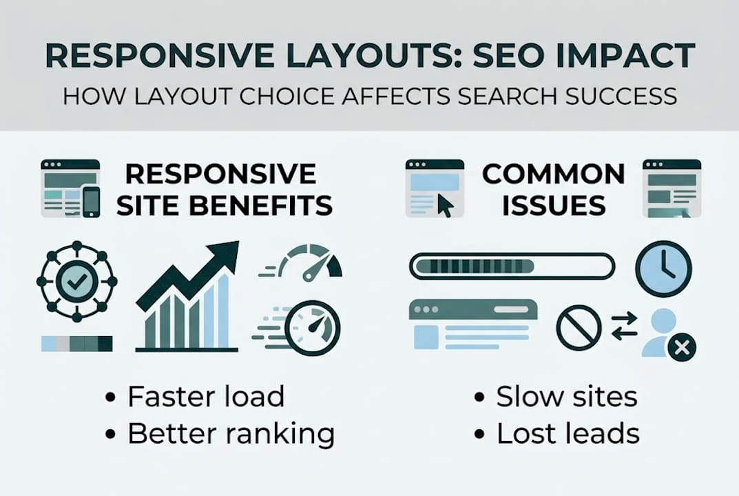
The benefits of switching to a responsive layout are concrete. Small businesses that understand what responsive design actually involves tend to act faster and see results sooner. Those results can be substantial: SMBs with responsive sites grow 2.5 times faster than those without one.
For Melbourne businesses, this is especially relevant. Local customers expect fast, seamless browsing. If your digital storefront doesn't deliver that, you're handing enquiries to whoever does.
Pro Tip: Use Google's free Mobile-Friendly Test tool to check whether your current site passes the basics. It takes less than a minute and gives you an immediate snapshot of where you stand.
Responsive design also simplifies your workflow. Instead of managing two separate sites, one for desktop and one for mobile, you maintain a single site that works everywhere. That means less time on admin and more time running your business.
The business impact: Local leads, ROI, and cost savings
Understanding 'responsive' is important, but how does it translate to real business results in Melbourne?
The numbers are hard to ignore. Businesses that adopt responsive design report 67% more leads and 245% higher returns on investment compared to those still running outdated desktop-only layouts. For a small business, that kind of lift can be the difference between a quiet month and a fully booked one.
"Responsive design isn't just about looking good on a phone. It's about making sure every potential customer can actually reach you, no matter how they're searching."
Cost is another factor worth considering. Many business owners assume that building a mobile-friendly site means building two sites. In reality, a single responsive site is around 35% cheaper to develop and maintain than running separate mobile and desktop versions. You save on design, development, hosting, and ongoing updates.
Here's a quick comparison to make that clear:
| Factor | Responsive site | Separate mobile and desktop sites |
|---|---|---|
| Development cost | Lower (single build) | Higher (two builds) |
| Maintenance effort | One site to update | Two sites to manage |
| SEO performance | Stronger (unified signals) | Weaker (split content) |
| User experience | Consistent across devices | Often inconsistent |
| Long-term scalability | Easier to grow | More complex to scale |
For Melbourne businesses, the advantages of responsive web design go beyond the numbers. Local competition is intense. Trades, professional services, and retail businesses are all competing for the same mobile searches. A responsive site means you show up properly when it counts.

If you're weighing up whether a website redesign makes sense financially, the ROI data is a strong argument in favour. And if you want to see what a well-built responsive site looks like in practice, local business website examples from Melbourne give you a clear picture of what's achievable.
Pro Tip: When reviewing quotes for a new website, ask specifically whether the design will be fully responsive across all major devices and browsers. Don't assume it's included.
Responsive layouts and local SEO: Be found by Melbourne customers
So, beyond direct business benefits, how do responsive layouts help your site get found by more local customers?
Google has used mobile-first indexing since 2019, which means it primarily looks at the mobile version of your site when deciding where to rank you. If your mobile experience is poor, your rankings suffer, even if your desktop site looks polished. For Melbourne small businesses trying to appear in local search results, this is critical.
The connection between responsiveness and local SEO works through several pathways:
| SEO factor | How responsive design helps |
|---|---|
| Site speed | Clean, adaptive code loads faster on mobile |
| Bounce rate | Better experience means visitors stay longer |
| Unified content | One URL means stronger, undivided SEO signals |
| Local search visibility | Mobile-friendly sites rank higher in Google Maps and local results |
Beyond the technical side, responsive design for small businesses in Melbourne creates a better overall experience that keeps people on your site longer. Longer visits, more pages viewed, and lower bounce rates all signal to Google that your site is worth ranking.
Here's a practical checklist for improving your local SEO through responsive design:
- Ensure your site loads in under three seconds on mobile. Slow sites lose visitors fast.
- Use legible font sizes so text doesn't require pinching and zooming to read.
- Make your phone number and contact form tap-friendly so mobile users can reach you instantly.
- Avoid intrusive pop-ups on mobile. Google penalises sites that interrupt the mobile experience.
- Test your site on multiple devices regularly, not just once after launch.
SMBs with responsive layouts grow 2.5 times faster, and a significant part of that growth comes from improved search visibility. When your site is easier to find and easier to use, enquiries follow naturally.
Pro Tip: Follow the mobile responsive design guide for Melbourne businesses to get a structured walkthrough of exactly what to prioritise when optimising your site for local search.
How to make your site responsive: Steps, tips, and pitfalls to avoid
With the 'why' and 'how it helps' addressed, let's break down exactly how you can make your site responsive, and common traps to avoid.
Step 1: Audit your current site Start by checking how your site performs on mobile. Use Google's Mobile-Friendly Test or PageSpeed Insights. Look for text that's too small, buttons that are hard to tap, and images that break the layout on smaller screens.
Step 2: Choose the right platform or theme If you're using a website builder like WordPress, Squarespace, or Wix, choose a theme that's built for responsiveness from the ground up. Not all themes are equal. A theme marketed as 'mobile-friendly' isn't always the same as genuinely responsive.
Step 3: Work with a reliable specialist For most small business owners, building a responsive site from scratch without professional help leads to costly mistakes. A specialist who understands designing a mobile-friendly website properly will save you time and money. Consider that responsive development is 35% cheaper than maintaining two separate sites, so investing in a quality build once is better than patching problems later.
Step 4: Test across real devices Don't just preview your site in a browser window. Test it on actual phones and tablets. What looks fine on a desktop preview can break on an older Android device or a small iPhone screen.
Step 5: Optimise for speed Compress your images, reduce unnecessary plugins, and use a reliable host. A responsive layout won't help if your site takes eight seconds to load.
Common pitfalls to watch for:
- Ignoring site speed after switching to a responsive layout
- Content overlap where text or images collide on mid-sized screens
- Overusing pop-ups that block content and frustrate mobile users
- Assuming a responsive theme is enough without testing or customisation
For practical small business web design tips tailored to businesses like yours, there's plenty of guidance available to help you avoid these mistakes from the start.
A Melbourne perspective: Why responsive design is no longer optional
Here's something we've observed working with Melbourne small businesses across trades, professional services, and local retail. The businesses that upgraded their websites to responsive layouts two or three years ago are now noticeably ahead. Not because they did anything extraordinary, but because they stopped losing ground.
Melbourne's local search environment is competitive. Customers looking for a plumber in Fitzroy, an accountant in Richmond, or a café in Collingwood are making decisions fast, almost always on a phone. If your site fumbles that first impression, you don't get a second chance.
What surprises many business owners is how disproportionate the benefit is for early movers. While competitors sit on outdated layouts, businesses with responsive sites grow 2.5 times faster. That gap widens the longer others wait. The responsive advantages for Melbourne businesses aren't theoretical. They show up in enquiry numbers, in Google rankings, and in the confidence customers feel when they land on a site that actually works.
Our view is straightforward: waiting for a 'better time' to upgrade is itself a business risk. The longer a non-responsive site stays live, the more ground it loses. Starting with strong foundations now means your site can grow with your business instead of holding it back.
Get expert help for your Melbourne website
At Troov Marketing, we work with Melbourne small businesses to build websites that perform well from day one. That means fast, responsive layouts built with local SEO in mind, so your site is ready to attract and convert local customers. If you're not sure whether your current site is doing the job, we can help you find out. Our Melbourne web design help covers everything from responsive builds to mobile performance reviews. We also offer Melbourne SEO support for businesses wanting to improve their local visibility alongside their website. Explore how our website and local SEO services work together to help you grow.
Frequently asked questions
How do responsive layouts improve local SEO for my Melbourne business?
Responsive layouts make your site mobile-friendly, which Google prioritises in local search rankings, helping more Melbourne customers find you. SMBs with responsive sites grow 2.5 times faster, with much of that growth driven by stronger local search visibility.
Are responsive sites more cost-effective than running separate mobile and desktop versions?
Yes. Responsive designs are approximately 35% cheaper to develop and maintain compared to building and managing two separate sites, making them the smarter long-term investment.
How quickly can I see results after making my website responsive?
Many small businesses notice improvements in leads and engagement within a few weeks of upgrading. Adopting responsive design is linked to 67% more leads and a 245% increase in ROI for small businesses.
What is the main risk of not having a responsive website in 2026?
Without a responsive site, you risk losing mobile visitors, dropping in Google rankings, and missing out on local growth. Currently, only 62% of small business sites are fully responsive, which means non-adopters are already at a competitive disadvantage.