
Over 60% of website traffic now comes from mobile devices, yet many Melbourne small businesses are still running websites that look broken or frustrating on a phone. If a potential customer lands on your site and has to pinch, zoom, or squint to find your phone number, they will leave. Fast. This guide walks you through exactly what responsive design is, why it directly affects your local SEO and customer engagement, and what practical steps you can take right now to make sure your website is working for you, not against you.
Table of Contents
- What is responsive design and why is it crucial?
- How responsive design boosts local SEO in Melbourne
- Customer engagement: Why mobile experience decides conversions
- Common responsive design pitfalls and how to solve them
- Practical steps: Getting started with responsive design
- Take your Melbourne website to the next level
- Frequently asked questions
Key Takeaways
| Point | Details |
|---|---|
| Mobile-first is now essential | With most customers browsing on phones, responsive design is a must-have for Melbourne small businesses. |
| SEO boost from responsive sites | Responsive design helps you rank higher in local Melbourne searches and attracts new customers. |
| Better customer engagement | Mobile-friendly sites increase engagement and can double your conversions compared to non-responsive ones. |
| Watch for common pitfalls | Small errors in mobile design can cost leads, but simple fixes deliver big improvements. |
| Start improving today | Small steps taken now can make your site easier to find and easier for local customers to use. |
What is responsive design and why is it crucial?
With the stakes set, let's clarify exactly what responsive design means for your business.
A mobile-friendly website automatically adapts its content and layout to the screen size and orientation of any device. Whether someone visits your site on a desktop, a tablet, or a smartphone, they see a version that fits their screen perfectly. No awkward scrolling. No tiny text. No broken images.
The three core principles behind responsive design are:
- Fluid grids: Page layouts that resize proportionally rather than staying fixed at one width.
- Flexible images: Images that scale up or down to fit their container without distorting.
- Media queries: Code instructions that tell the browser how to display content at different screen sizes.
These principles work together to create a seamless experience across all devices. And that experience matters enormously for trust. When a visitor lands on a polished, easy-to-use site, they feel confident in your business. When they land on something clunky and hard to read, they question your credibility before they have even read a word.
A website that works well on every device is no longer a bonus feature. It is the baseline expectation your customers bring to every interaction.
Over 50% of small business web traffic now originates from mobile users. If your site is not built around responsive design basics, you are already behind.
How responsive design boosts local SEO in Melbourne
Now that we know what responsive design is, let's see why it is directly tied to your ability to get found online in Melbourne.
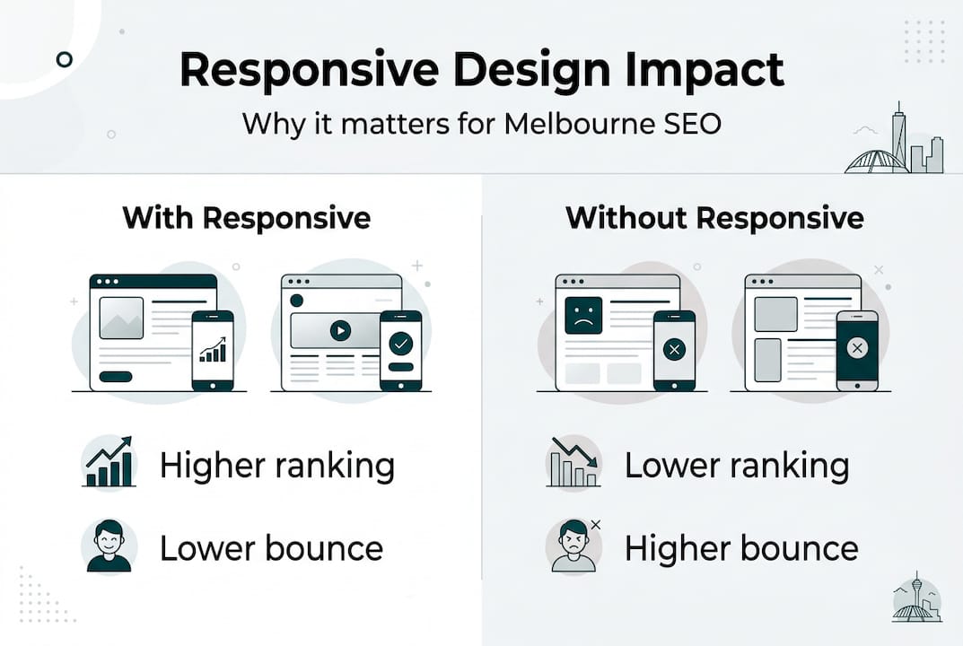
Google rewards mobile-friendly sites with higher local search rankings. This is not a rumour or a best-practice suggestion. It is a confirmed ranking factor. When someone in Melbourne searches for a plumber, a café, or a bookkeeper near them, Google prioritises sites that deliver a good mobile experience.
Here is a comparison of how responsive and non-responsive sites typically perform across key local SEO metrics:
| Metric | Responsive site | Non-responsive site |
|---|---|---|
| Google local ranking | Higher | Lower |
| Bounce rate | Lower | Higher |
| Time on site | Longer | Shorter |
| Conversion rate | Better | Weaker |
| Mobile page speed | Faster | Slower |
The numbers tell a clear story. Non-responsive sites can lose up to 50% of visitors immediately. That is half your potential customers walking out the door before they have seen what you offer.
Statistic to note: Businesses investing in boosting Melbourne SEO through professional, mobile-ready websites have seen local search visibility improve by as much as 45%.
Pro Tip: Pair your responsive design with structured data markup and fast load speeds. Structured data helps Google understand your business details, such as your address, trading hours, and services, which strengthens your presence in local search results. You can explore the full responsive advantages this combination delivers.
Customer engagement: Why mobile experience decides conversions
Local SEO gets visitors in the door, but will they stay and become customers? Let's examine how your site's look and feel on mobile impacts engagement.

Mobile users abandon sites that load slowly or are hard to navigate on their device. This is not just an inconvenience. It is a direct hit to your revenue. When someone cannot easily tap your call button, find your address, or complete a booking form on their phone, they give up and call your competitor instead.
Here is how responsive and non-responsive sites compare on engagement:
| Engagement factor | Responsive site | Non-responsive site |
|---|---|---|
| Average session duration | Longer | Shorter |
| Pages viewed per visit | More | Fewer |
| Form completion rate | Higher | Lower |
| Click-to-call usage | Higher | Lower |
To make your site more conversion-friendly for mobile users, work through these steps:
- Make your phone number clickable. A tap-to-call button removes friction instantly.
- Simplify your navigation. Mobile menus should be clean and easy to open with one thumb.
- Shorten your forms. Ask only for what you need. Long forms on small screens drive people away.
- Use large, tappable buttons. Buttons should be at least 44 pixels tall so they are easy to press.
- Display your key information above the fold. Your location, services, and contact details should be visible without scrolling.
Pro Tip: Review your mobile optimisation benefits by checking your Google Analytics data. If your mobile bounce rate is significantly higher than desktop, that is a clear signal your mobile experience needs attention. Exploring mobile-first strategies can help you close that gap quickly.
Common responsive design pitfalls and how to solve them
Even the best intentions can go astray. Here is what to watch for so you do not undermine your efforts.
Many Melbourne small businesses make the same avoidable mistakes when it comes to mobile design. Knowing what they are puts you ahead of the pack.
Common pitfalls include:
- Cluttered layouts: Too much content crammed onto a small screen makes everything hard to read and harder to act on.
- Hidden or broken menus: Navigation that works on desktop but collapses into an unusable mess on mobile is a major frustration.
- Tiny touch targets: Links and buttons that are too small to tap accurately cause errors and annoyance.
- Unscalable fonts: Text that is too small to read without zooming in pushes visitors away immediately.
- Slow-loading images: Large image files that are not optimised for mobile drag down your page speed and your rankings.
The fixes are straightforward. Test your site regularly on real devices, not just in a desktop browser. Use scalable fonts that remain readable at smaller sizes. Make sure every button and link is easy to tap with a finger.
Failing to regularly test your website on actual devices is a common and costly mistake that many small businesses do not realise they are making.
Pro Tip: Use Google's free Mobile-Friendly Test tool to simulate how your site appears on different devices. It flags specific issues and gives you a starting point for fixes. Reviewing common website mistakes alongside this test gives you a fuller picture of what to address. You can also explore the broader responsive advantages of getting these details right.
Practical steps: Getting started with responsive design
Ready to take action? Here is a straightforward pathway for any Melbourne business owner to start seeing real gains.
A clear action plan helps small businesses prioritise improvements without overwhelm. You do not need to fix everything at once. Start with the highest-impact changes and build from there.
- Run a mobile audit. Open your website on your own phone and a friend's phone. Note anything that looks off, loads slowly, or is hard to use.
- Check your page speed. Use Google PageSpeed Insights to get a free score and a list of specific improvements.
- Review your navigation. Make sure your menu is easy to open and close on a small screen, and that key pages are no more than two taps away.
- Optimise your images. Compress all images before uploading them. Large files are one of the most common causes of slow mobile load times.
- Test your contact options. Confirm that your phone number links to a call, your address links to Google Maps, and any forms work correctly on mobile.
- Assess your platform. If your site is built on an outdated platform that does not support responsive design, it may be time to consider a rebuild. Review the website mistakes guide to understand what warning signs to look for.
- Decide when to get professional help. If the audit reveals deep structural issues, or if you simply do not have the time to manage it yourself, working with a specialist is often the most cost-effective path. Explore small business web design tips to understand what a well-built site should include.
The goal is not perfection on day one. It is steady, meaningful progress that builds a stronger digital presence over time.
Take your Melbourne website to the next level
If this article has shown you anything, it is that responsive design is not a technical luxury. It is the foundation your entire online presence is built on. At Troov Marketing, we specialise in building fast, modern websites for Melbourne small businesses that are structured to perform well on every device and support your local SEO from day one. Whether you are starting fresh or upgrading an existing site, we can help you build your dream small business website with confidence. We also help you combine design and local SEO so your site does not just look good but actually brings in enquiries. If you are ready to invest in a website that works as hard as you do, explore our small business SEO services and let's have a conversation.
Frequently asked questions
What exactly does responsive design mean?
Responsive design automatically adapts any website for all device sizes, meaning your site adjusts its layout and features to look great and work well whether someone visits on a phone, tablet, or desktop.
How does responsive design improve my Google ranking?
Google rewards mobile-friendly sites with better rankings, so a responsive site will appear higher in local Melbourne searches compared to competitors whose sites are not mobile-friendly.
What's the top mistake to avoid with responsive web design?
Failing to regularly test your website on actual devices is the biggest mistake, as it makes it easy to miss display or usability issues that drive customers away.
Can I make my current site responsive or do I need a new one?
You can often upgrade your existing website to be responsive, but very old or structurally limited designs may need a full rebuild to achieve the best results.
Is responsive design more expensive than a regular website?
Responsive websites usually require a slightly higher initial investment, but the improvement in engagement, enquiries, and conversions makes it far more cost-effective over the long term.